by jeff
Revolte AI branding by Studio builds a cold, precise identity for automated intelligence: geometric marks, dark palettes, and sharp typographic contrast.
Most brand systems don't commit this hard to their subject matter. Revolte AI branding is a Behance project that takes a clear position. It builds a visual language for automated intelligence. The goal is systemic, not decorative. The result is a dark-mode identity. It draws from developer tooling, terminal culture, and Swiss type discipline. The design has real conviction.
The project is built around Revolte. It's a platform focused on speed, deployment, and developer tooling. Every design choice in the Revolte AI branding system reflects those values. The identity skips ornament entirely. It uses a near-black background, white type, and a tight lavender-purple accent. These three elements structure information without reaching for decoration.
Revolte AI Branding: Color, Type, and the Logic of the Mark
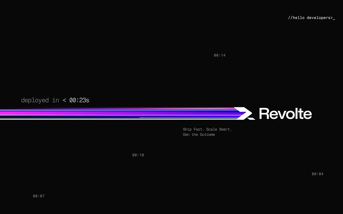
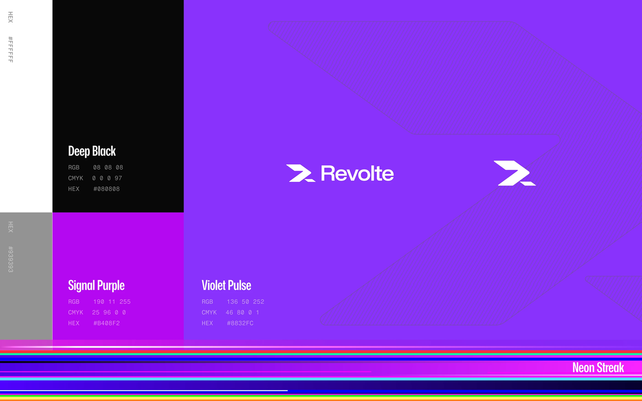
The Revolte AI branding color system has three registers. The background is near-black. Empty space feels active, not absent. White carries the logo and main type content. A violet-purple accent is the third register. It appears on numerals and annotation elements only. It adds structure without disrupting the dark palette. A gradient streak runs across select layouts. It moves from cyan through electric blue, purple, and into hot magenta. This is the identity's main kinetic signature. The streak signals data in motion and deployment speed.
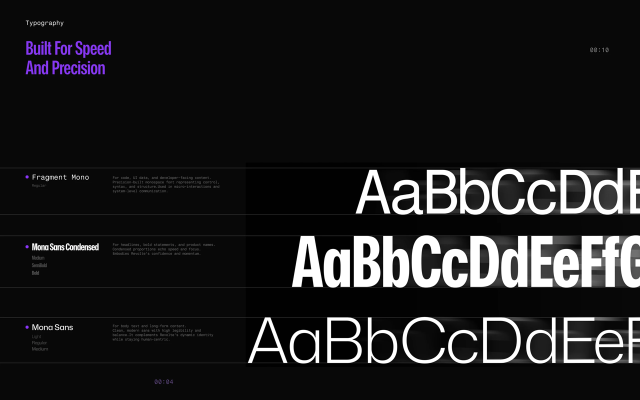
Revolte AI branding uses three type styles. The first is a heavy tight sans-serif for headlines. It's set in Title Case with tight spacing and a high x-height. It works at massive editorial scale. An italic version adds urgency in environmental uses. The second style is a light monospaced font. It handles deployment timestamps, terminal notation, and metrics. This monospace choice is the sharpest call in the system. It ties Revolte to developer culture without irony. A third regular sans-serif covers body copy. It keeps things readable inside a high-contrast layout.
Logomark Design and Compositional Approach in Revolte AI Branding
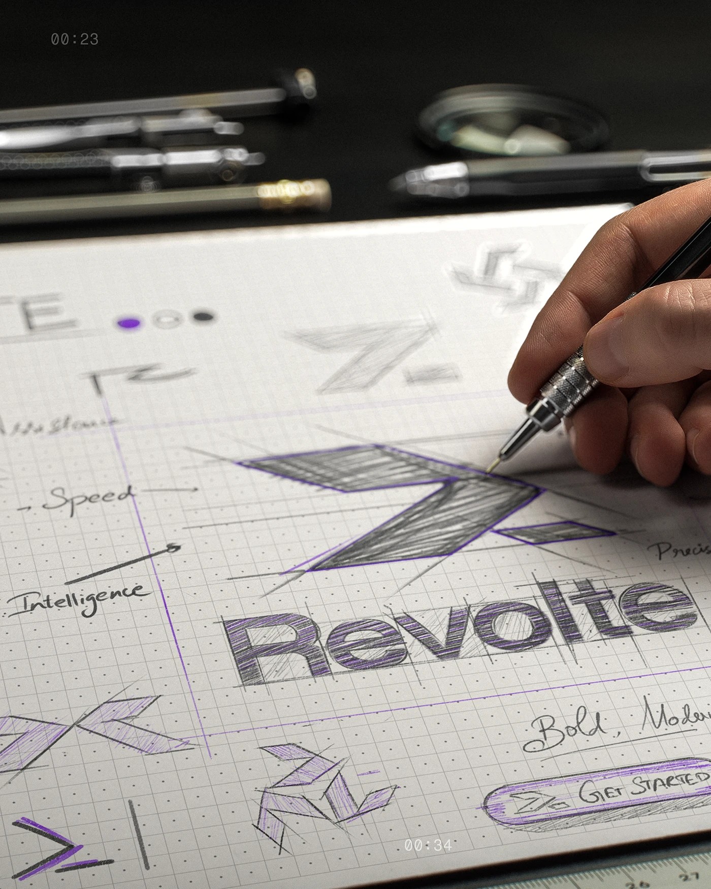
The Revolte logomark is built from two overlapping chevron shapes. They're slightly offset. This creates a feeling of layering and forward motion. The mark is pure white and sharp-edged. It reads like a deployment arrow or a terminal bracket pair. It locks up with the logotype in a horizontal arrangement. The logotype uses a bold geometric sans-serif. Both scale well, from large hero formats down to small environmental use. That range is the real test of a solid mark.
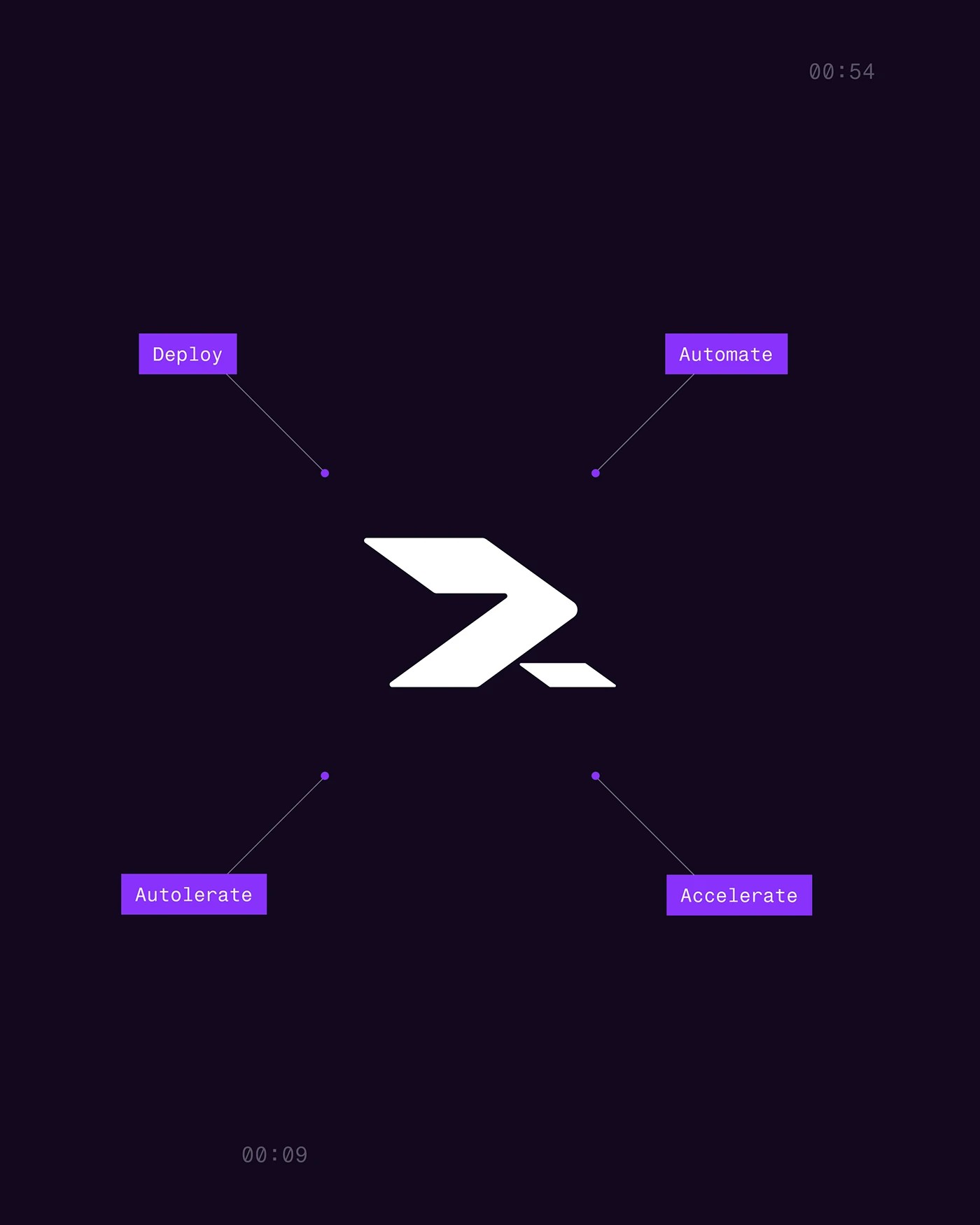
The layout in Revolte AI branding is asymmetric. Elements float rather than sit on a fixed grid. Deployment timestamps appear in monospace type at varying sizes and positions. They give the canvas a sense of real-time activity. The density is controlled. Things feel active but not cluttered. The brand values layout stacks four numbered pillars with generous space. A body paragraph in the lower left cross-references them with superscript numbers. It gives the design a documentation feel inside an otherwise high-contrast poster.
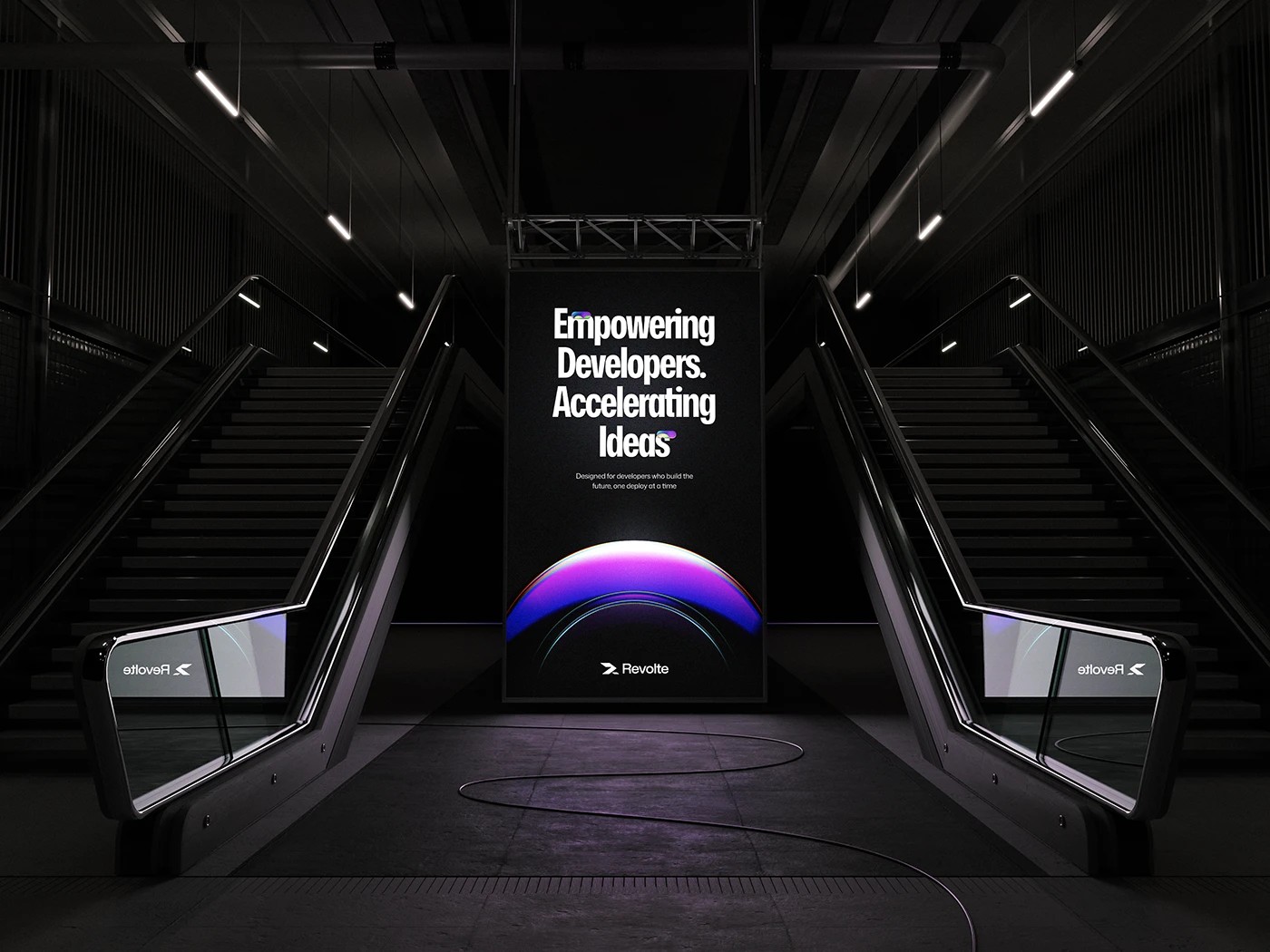
One mockup takes Revolte AI branding into a subway escalator space. A vertical banner sits between two escalator shafts on a dark background. The headline is set in the italic display weight. At the base of the panel sits a luminous gradient hemisphere. It uses the same blue-purple-magenta gradient from the streak. It reads as an abstract launch or sunrise. Thin elliptical curves on the floor echo the orb's shape. They extend the mark's visual language into three-dimensional space. The Revolte logotype sits at the bottom of the poster. A mirrored version appears on the glass escalator panels.

Revolte AI branding stands out from typical tech identity work. The concept and the execution line up. That coherence is the real differentiator. Developer details like double-slash code comments, command-line syntax, and live metrics are never decoration. They carry genuine meaning inside the system. They tell you exactly how Revolte is meant to feel: intelligent, fast, always on.
Revolte AI branding is available to view in full on Behance. The project shows how an AI brand can earn technical credibility through design rigor. Not through overused visual tropes. It works through type, layout, and a system that mirrors how the product functions.