by abduzeedo
Bodega brand identity by Suin Choi uses a bold block typeface for its daytime grocery and an elegant serif for the evening dessert and wine bar ambience.
Some of the most interesting branding problems come from concepts that operate in two modes. Bodega, a concept designed by New York-based graphic designer Suin Choi, functions as a grocery store and coffee shop during the day before transforming into a dessert bar and wine destination at night. That dual identity presented a clear creative challenge: how do you build a brand identity that serves both personalities without splitting into two separate systems?
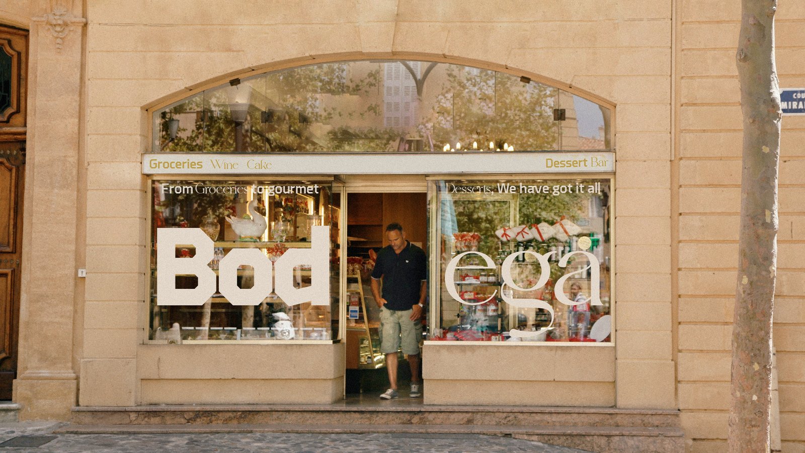
Choi, who previously worked at &Walsh and currently works at Chermayeff & Geismar & Haviv, resolved the problem through type. A block-based typeface carries the daytime brand identity, bringing a bold and functional tone that matches the practical character of a neighbourhood bodega. When the space shifts to its evening mode, a serif typeface introduces warmth, elegance, and a slower pace. Both typefaces coexist in the brand identity system without conflict because each occupies its own temporal territory.
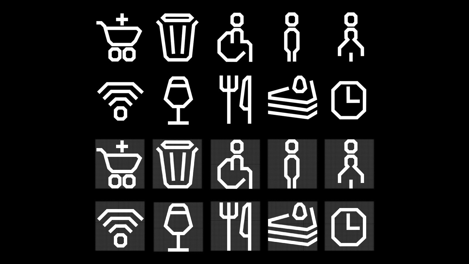
Oversized Logo and Icon System in the Brand Identity
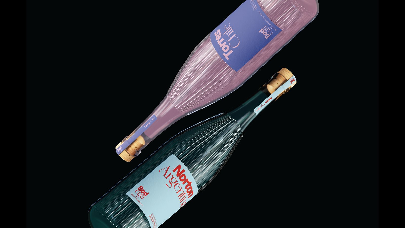
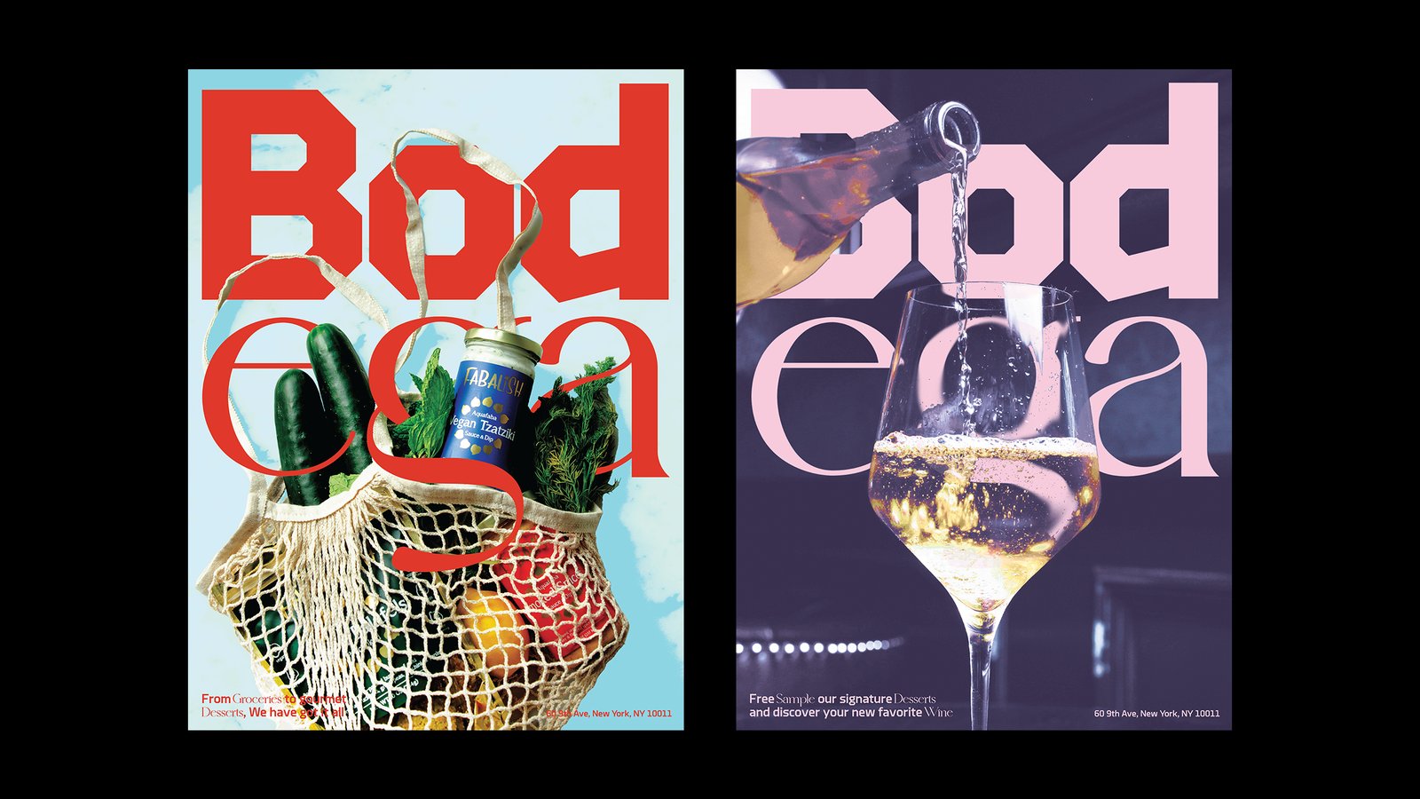
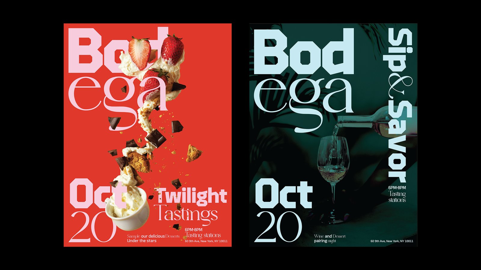
The brand identity centres on a bold, oversized logotype designed for strong poster impact. Product imagery including wine bottles, groceries, and desserts reinforces the dual concept throughout the visual system. An icon system mirrors the block-based structure of the main logo, extending the visual language consistently across posters and packaging applications throughout the brand identity.
The project received a Graphis Design Award Gold in 2025, recognising the coherence and conceptual clarity Choi brought to a genuinely tricky brief. The solution avoids the obvious move of separating day and night into two logos. Instead, it keeps the brand identity unified while allowing the typeface choices and product photography to signal the tonal shift between modes naturally and without confusion.
For students and early-career designers, the Bodega brand identity project demonstrates that conceptual constraints can generate creative freedom rather than limit it. Working with a dual-use concept forced a decision-making hierarchy that made every element of the brand identity more purposeful. The typeface choices, the oversized logotype strategy, and the icon system all trace back to that original problem of serving two distinct customer experiences within a single coherent brand.
Suin Choi's portfolio also includes branding work for Barnes & Noble and identity systems for music festivals. The Bodega brand identity stands as one of the strongest examples of her approach: sharp conceptual thinking translated into visual systems that work hard across every application.