by abduzeedo
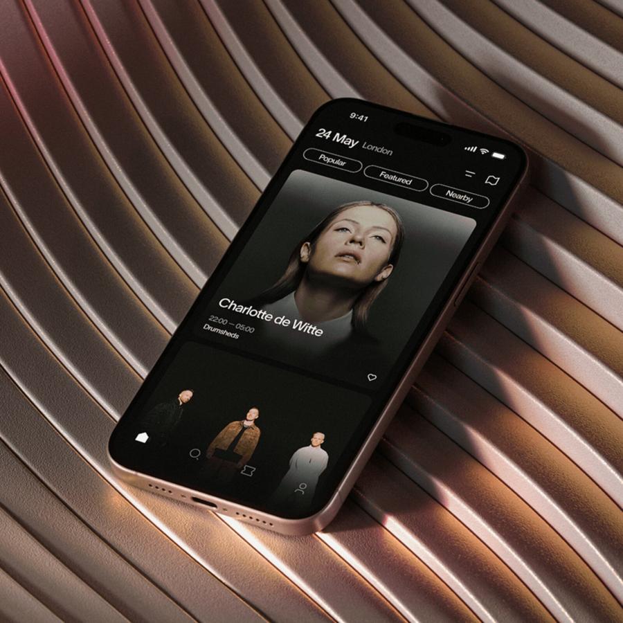
Nite event discovery app design uses dark mode UI and vivid gradients to give nightlife seekers a smooth way to explore and share local events near them.
Finding out what is happening nearby on a given night sounds simple, but most existing solutions bury the answer under generic category filters and flat listings. The Nite event discovery app design project approaches the problem from a nightlife-first perspective, building a UI system that feels native to the context it serves rather than adapted from a daytime productivity template.
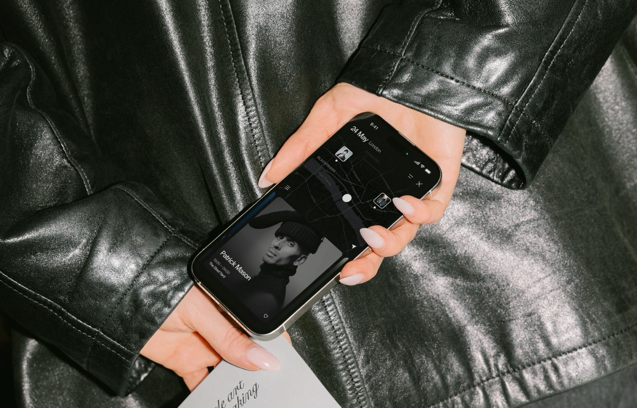
The design centres on a deep dark mode visual language. Most event discovery interfaces use light backgrounds that create visual fatigue when browsed at night. The Nite event discovery app inverts this logic, treating darkness as a canvas that makes venue photography and event imagery more immediate and vivid. Gradient overlays in electric purples, blues, and amber tones give each card its own atmosphere without making the interface feel visually chaotic or hard to navigate.

UI Decisions Inside the Nite Event Discovery App
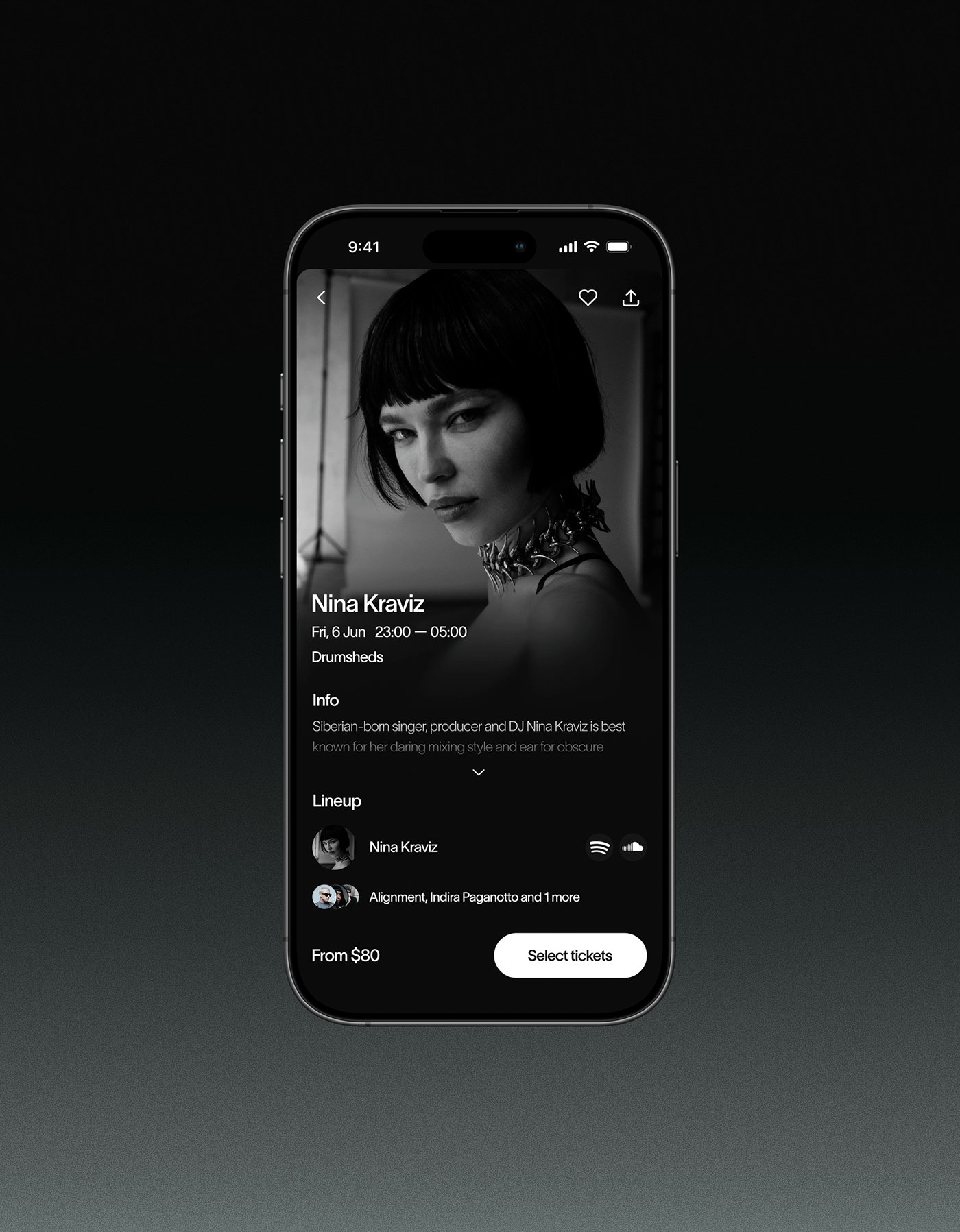
The Nite event discovery app organises content through a card-based system that prioritises visual hierarchy over text density. Each event card surfaces the venue image, event name, date, and a category tag. Proximity and social signals sit just below the fold within each card, giving users the context needed to make a quick decision without requiring a full detail view in the event discovery app.
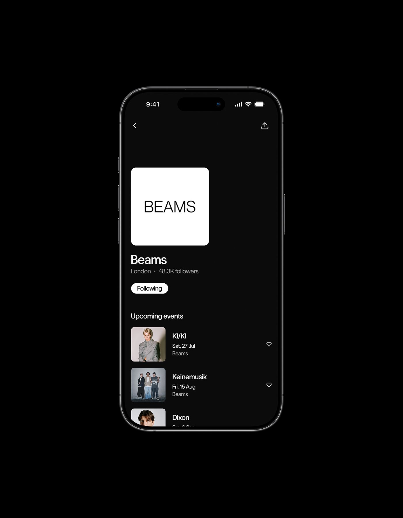
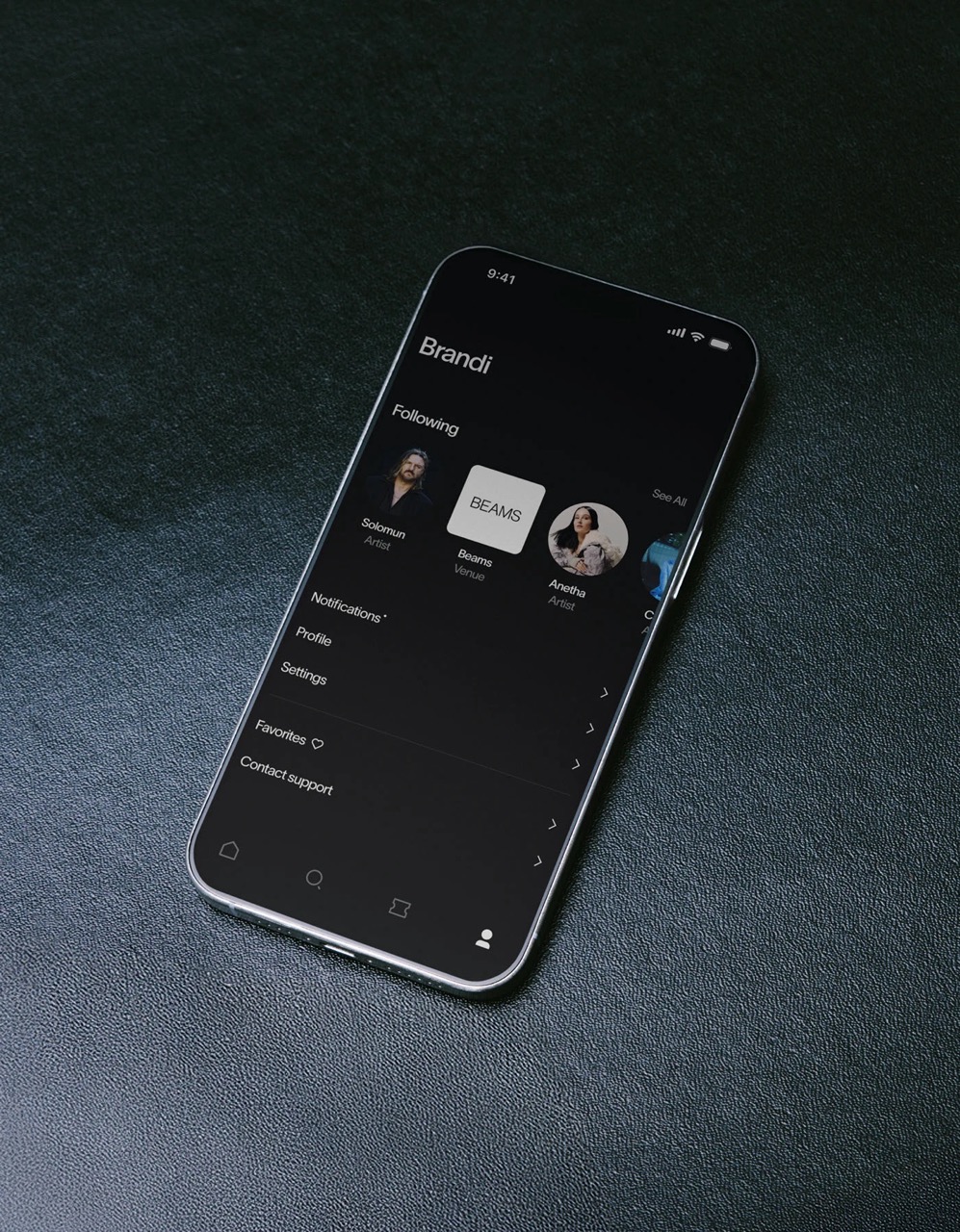
The navigation system keeps the most-used actions within thumb reach on a bottom bar. Discovery, saved events, social feed, and profile occupy the four primary slots. The event detail page expands the card's visual language into a full-screen experience, leading with the venue image before introducing ticketing options, lineup information, and map context in the event discovery app flow.
Typography across the Nite event discovery app uses a clean sans-serif that remains legible at small sizes while retaining personality at display scale. Weight contrast between event names and supporting details creates hierarchy without relying on colour alone. This approach ensures the event discovery app design remains accessible across different ambient light conditions, which matters for an app primarily used in evening environments.
For UI designers working on location-based social products, the Nite event discovery app project offers a useful reference. The decision to commit fully to a dark mode visual system gives the design a strong point of view and a coherent brand presence. The project was shared on Behance where the full UI system is documented.