by abduzeedo
Discover how Fishfinger’s pet branding for Wonderful World of Treats disrupts the pet aisle with storybook illustrations and immersive worlds that prioritize whimsy over clinical data.
Most pet treat packaging communicates function. It lists protein percentages. It uses clean sans-serifs in clinical white or forest green. It tells owners what the treat does, not what it feels like. Wonderful World of Treats, developed by London-based agency Fishfinger, takes the opposite position entirely.
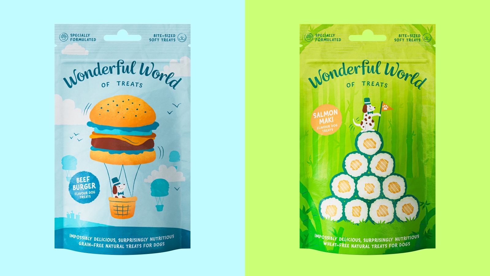
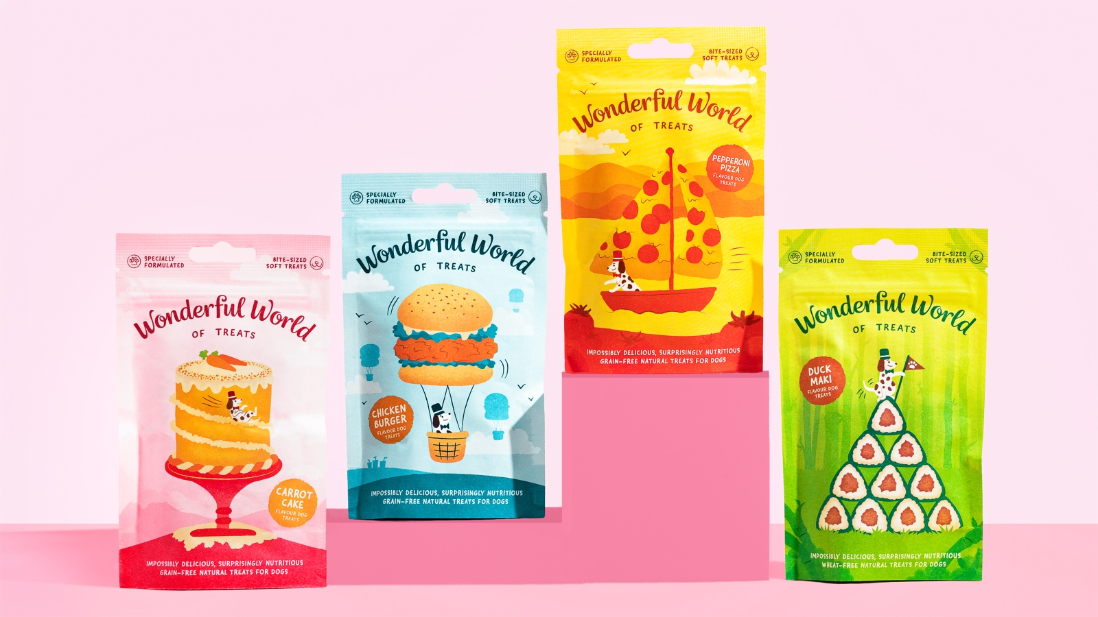
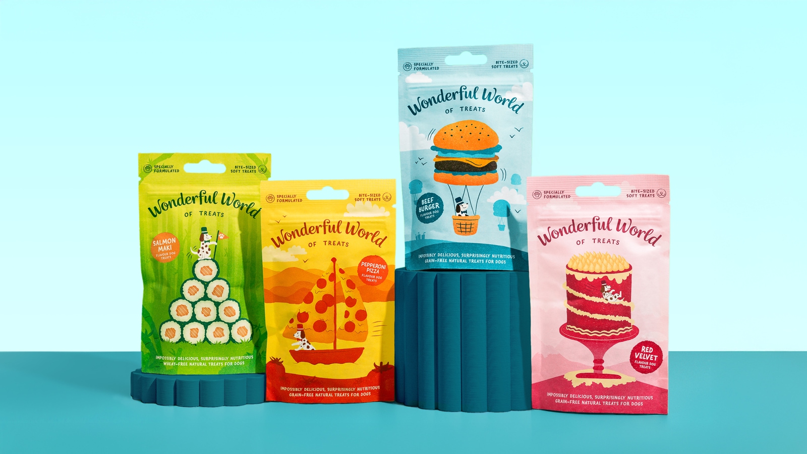
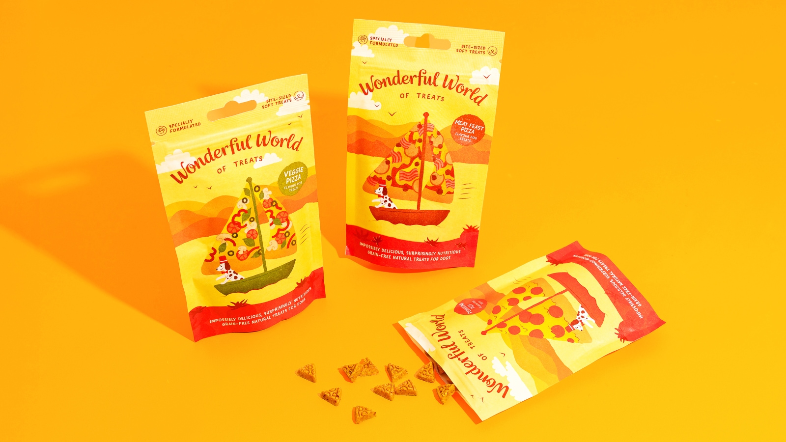
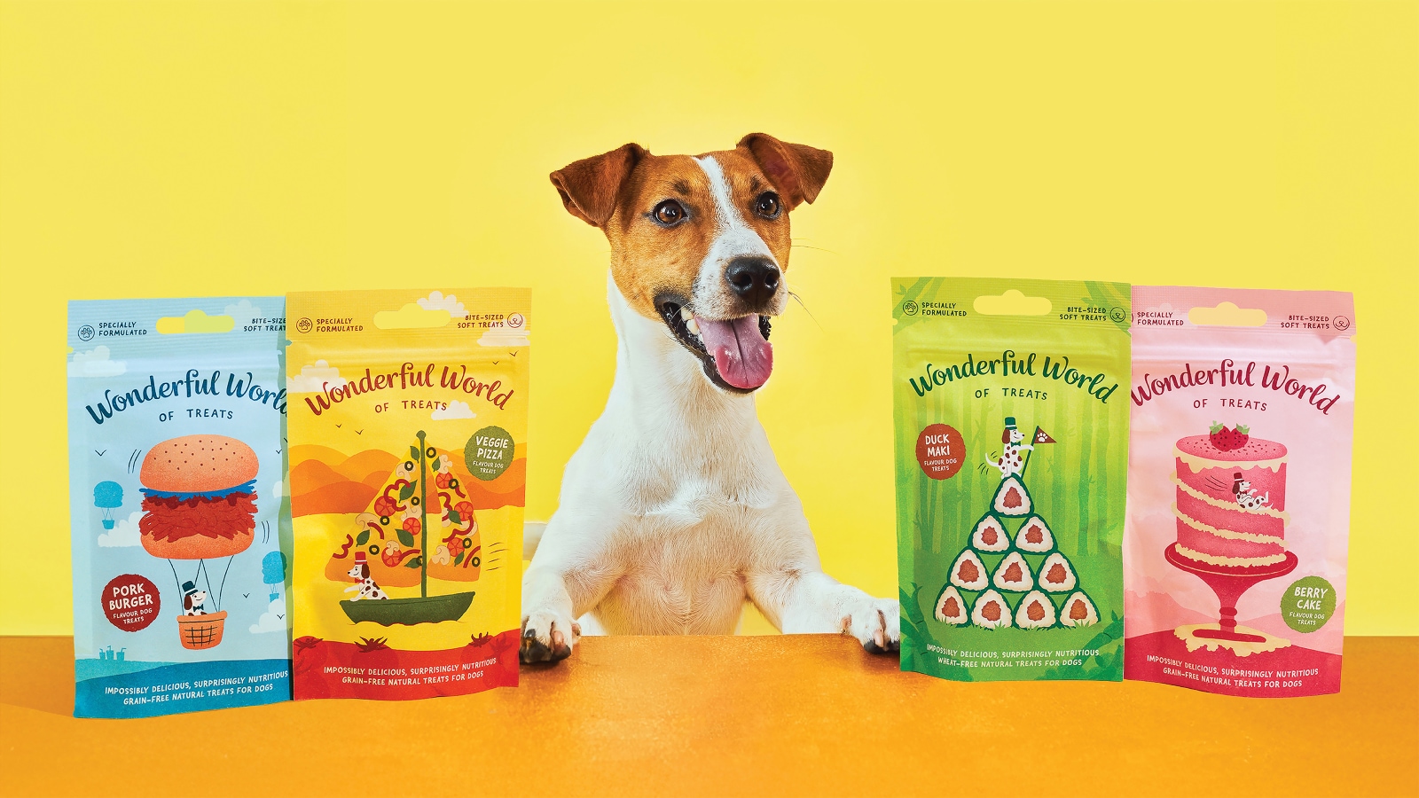
The brand identity Fishfinger built for this dog treat line does not resemble anything else on a pet store shelf. Each SKU occupies its own illustrated world — a distinct visual biome that transforms the treat flavor into a landscape. The Chicken Burger range sits inside a teal rolling-hills panorama where the hills themselves read as burger layers. Zooming out, a schnauzer rides a wicker basket suspended beneath a giant sesame-seeded bun, floating like a hot-air balloon through a pale sky. It is a single image that communicates flavor, whimsy, and brand personality simultaneously, without a word of body copy.
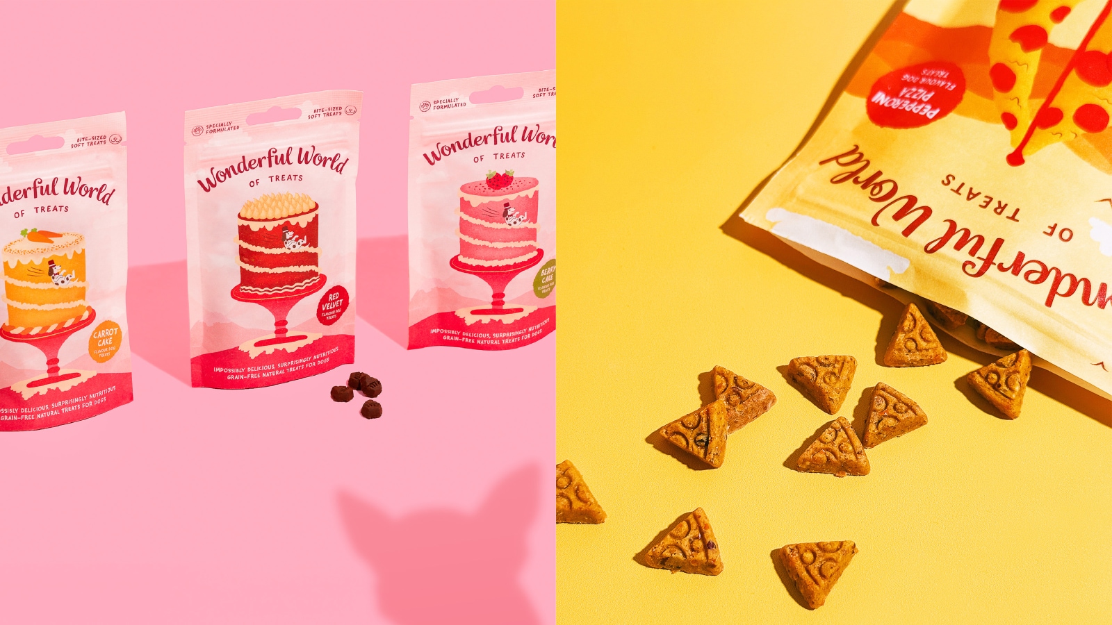
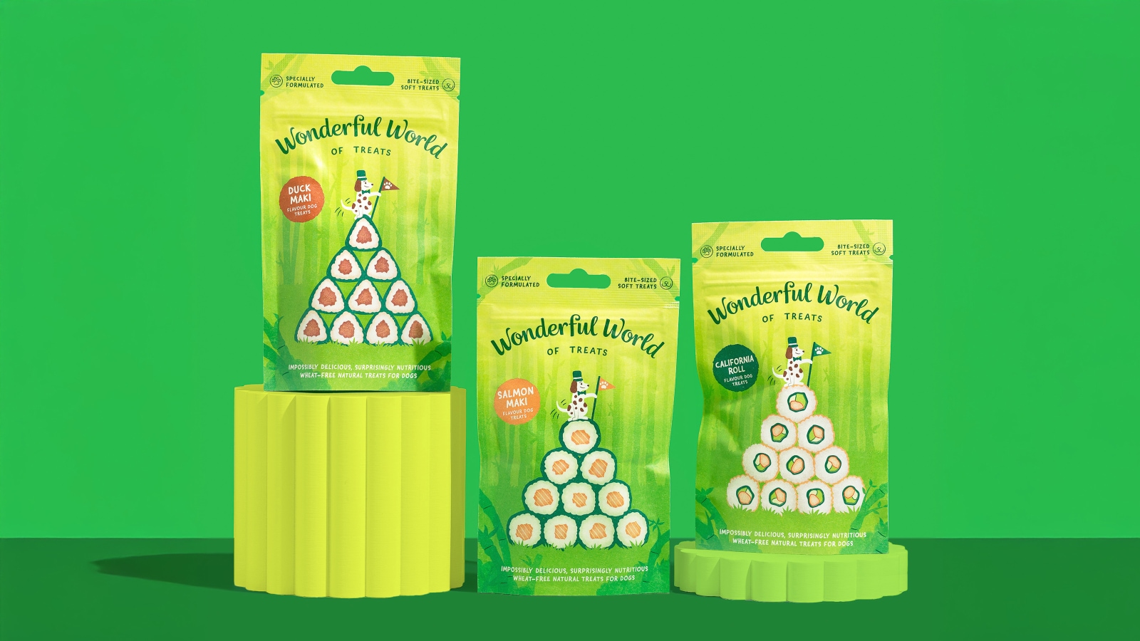
The color-coding is deliberate and consistent. Each flavor world gets its own palette. The Salmon Maki line is rendered in deep forest green — lush jungle undergrowth, sushi rolls rising from the vegetation, a soy bottle standing among the leaves like a landmark. The Red Velvet Cake range shifts to a rich crimson, with stylized pine tree silhouettes that read as ornate cake layers from a distance. The warm amber and sky blue of the Chicken Burger packaging give way to warm orange and terracotta for the Meat Feast Pizza. Each pouch is unmistakable at a glance, and each one feels like the cover of a children's book.
That storybook reference is not accidental. The wordmark for Wonderful World of Treats uses a custom rounded script — soft, handwritten in character, with bouncy baseline variation that signals friendliness without being childish. It is set against an illustrated scene rather than a solid field, which means the typography is always in dialogue with the world around it. This is a genuinely considered typographic decision: the script prevents the brand from reading as a toy, while the illustration keeps it from reading as a health product.
The structural logic of the packaging line matters too. Fishfinger built a system, not a series of one-offs. The treat flavors — Chicken Burger, Pepperoni Pizza, Salmon Maki, Berry Cake — are all human food analogues rendered at dog-treat scale. The brand concept hinges on that inversion: real treats shaped and inspired by human dishes, sold inside packaging that imagines a world where those dishes are geography. It is a layered idea that rewards close reading, and it works because every visual element reinforces it consistently.
The packaging is also entirely recyclable, which addresses a real gap in the pet treat category. This is not communicated through a heavy environmental label or a green badge — it is noted quietly, letting the visual identity carry the weight of differentiation. The brand's primary distribution through major UK retailers including Pets at Home means the shelf presence is critical. In that context, the illustrated world scenes function as a pattern interrupt. Nothing else in the aisle looks like this.
Fishfinger's work on Wonderful World of Treats demonstrates something worth noting about category disruption in branding. The most effective approach is not always a louder version of what already exists. Sometimes it is a completely different register — one that treats the shopper as someone who wants to feel something, not just be informed. The agency built a whole world to make that argument. It holds up.
Credits
- Author: Fishfinger Creative Agency: https://www.fishfinger.me/work/wonderfulworldoftreats / https://www.wonderfulworldoftreats.co.uk/
Pet Branding