by abduzeedo
ONY Agency rebuilt Think Agency's digital agency branding identity in 2026 around one metaphor: liquid that shifts, flows, and never locks into place.
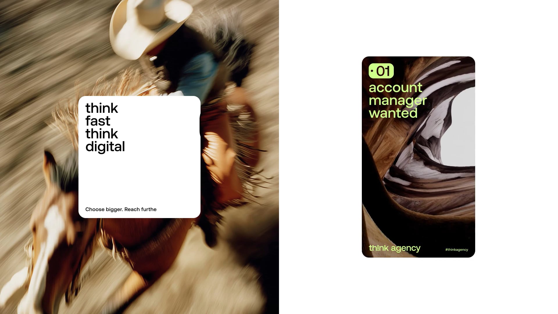
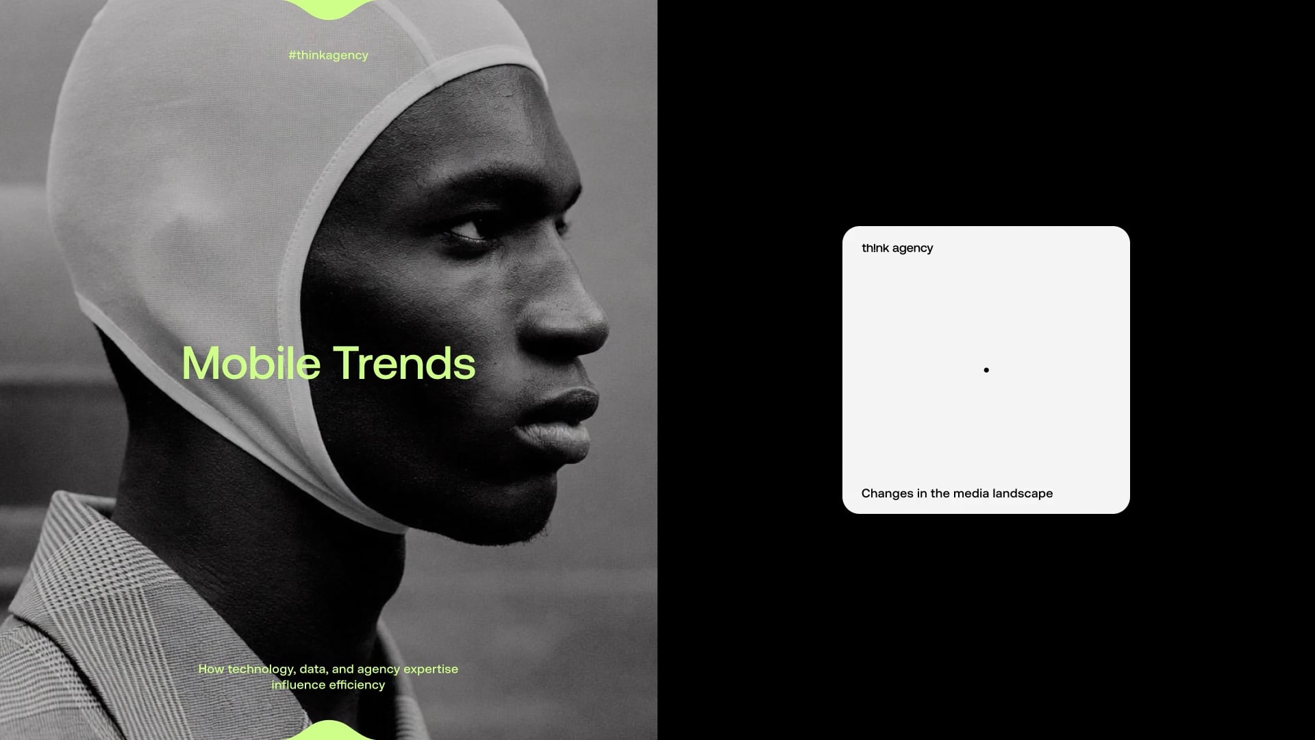
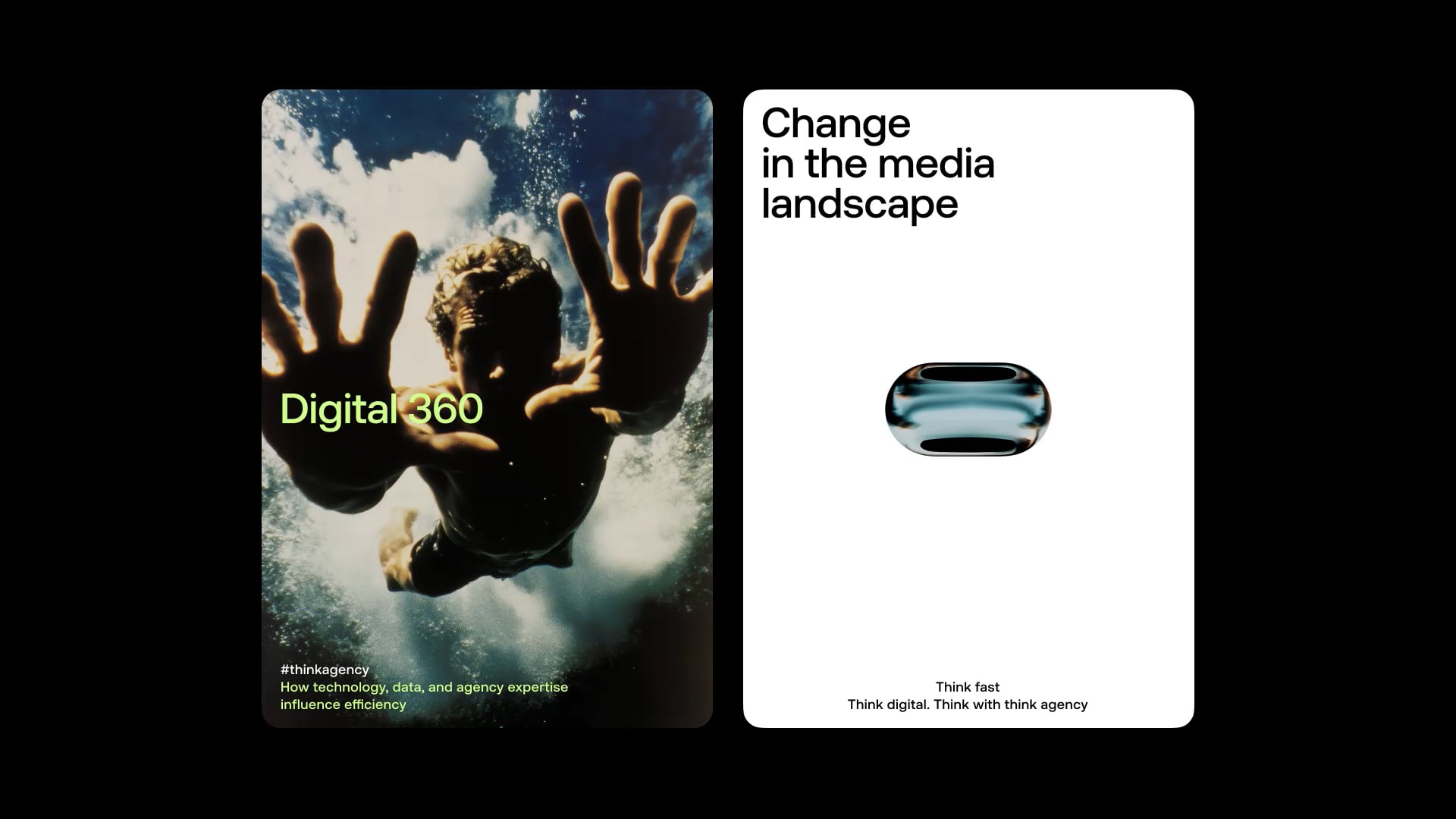
The core mark is a capsule form — three versions shown against white: blue, amber, translucent. Same shape, three different states. It contains photography, distorts it, holds it like liquid in a vessel. The signature green survived the rebrand but came back deeper — acid against black-and-white portrait photography in the "Mobile Trends" poster, where it cuts across a tight-cropped face and does all the heavy lifting. Photography across this digital agency branding identity system isn't illustrative. It's structural: a motion-blurred horse rider bleeds behind a white content card, an underwater figure reaches through a "Digital 360" frame. Eight scattered photos at diagonal angles on the cover — no grid, just controlled drift. The inspiration is Satoshi Kon's Paprika, and that reference holds: the system feels like it could reshape itself at any moment.
Digital Agency Branding Identity 2026: ONY Agency's Liquid System
Think Agency moved from mobile-focused shop to full-scale digital market player. That's a strategic repositioning — and ONY Agency built a system elastic enough to carry it. The white card layouts with oversized sans-serif type signal restraint. The liquid capsule mark, shifting from blue to amber to translucent across applications, signals something else: a 2026 digital agency branding identity that hasn't finished becoming what it is.