by abduzeedo
Rik Oostenbroek spent 20+ years making digital art for major brands. His wallpaper store brings gradient-rich abstract designs to everyday phone screens.
There is a particular kind of discipline required to make something that lives on a lockscreen. The image has to hold up at a glance. It has to work at 6am in bad light. It has to feel like something, not just look like something. Rik Oostenbroek has been thinking about this problem for two decades, and his answer is the rikoostenbroek store — a focused collection of digital art wallpaper packs designed explicitly for screens.
Digital Art Wallpapers Made by Hand
The store opens with a single line: "Made by a human being, not by a prompt." That framing matters. Oostenbroek is a self-taught Dutch artist whose client list reads like a brief history of visual culture — Apple, Adobe, Nike, Mercedes-Benz, Red Bull Racing, Taylor Swift, Samsung. He has shown at Art Basel, exhibited at Paris Photo, and spoken at Adobe MAX and OFFF Barcelona. He is not a hobbyist building a side project. The store is a deliberate act: taking the same craft applied to major brand campaigns and directing it toward personal use.
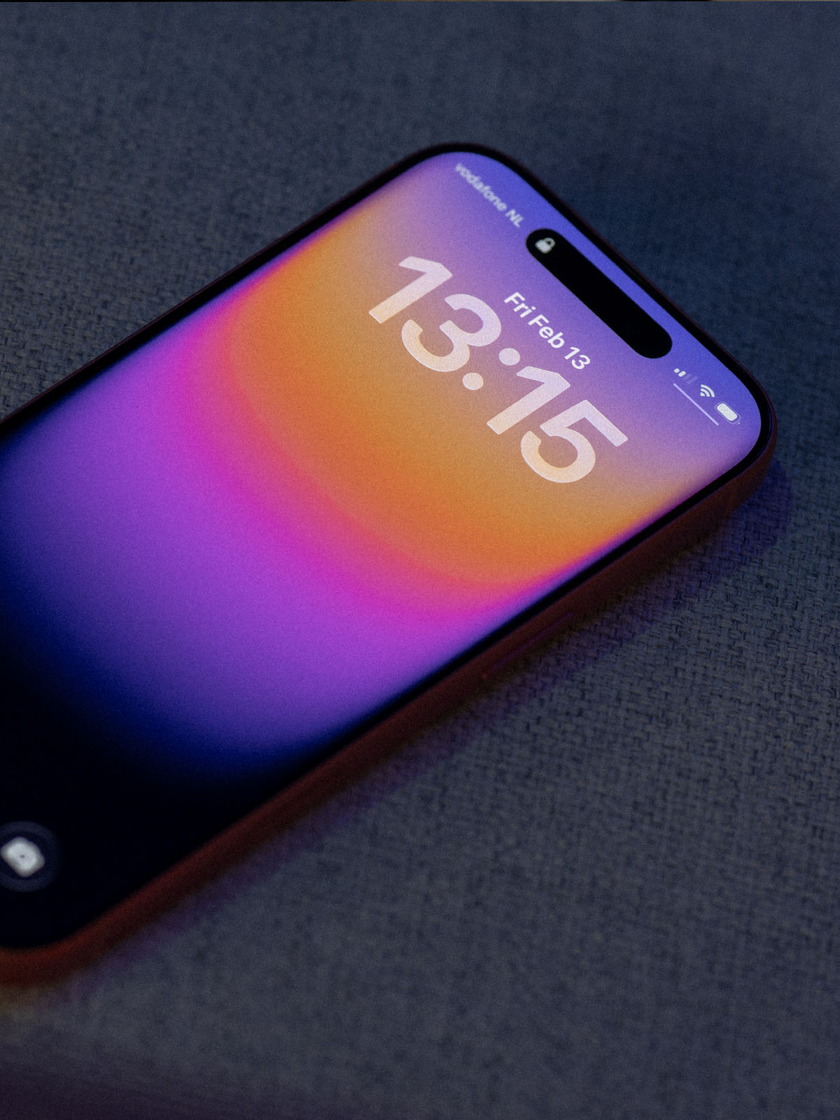
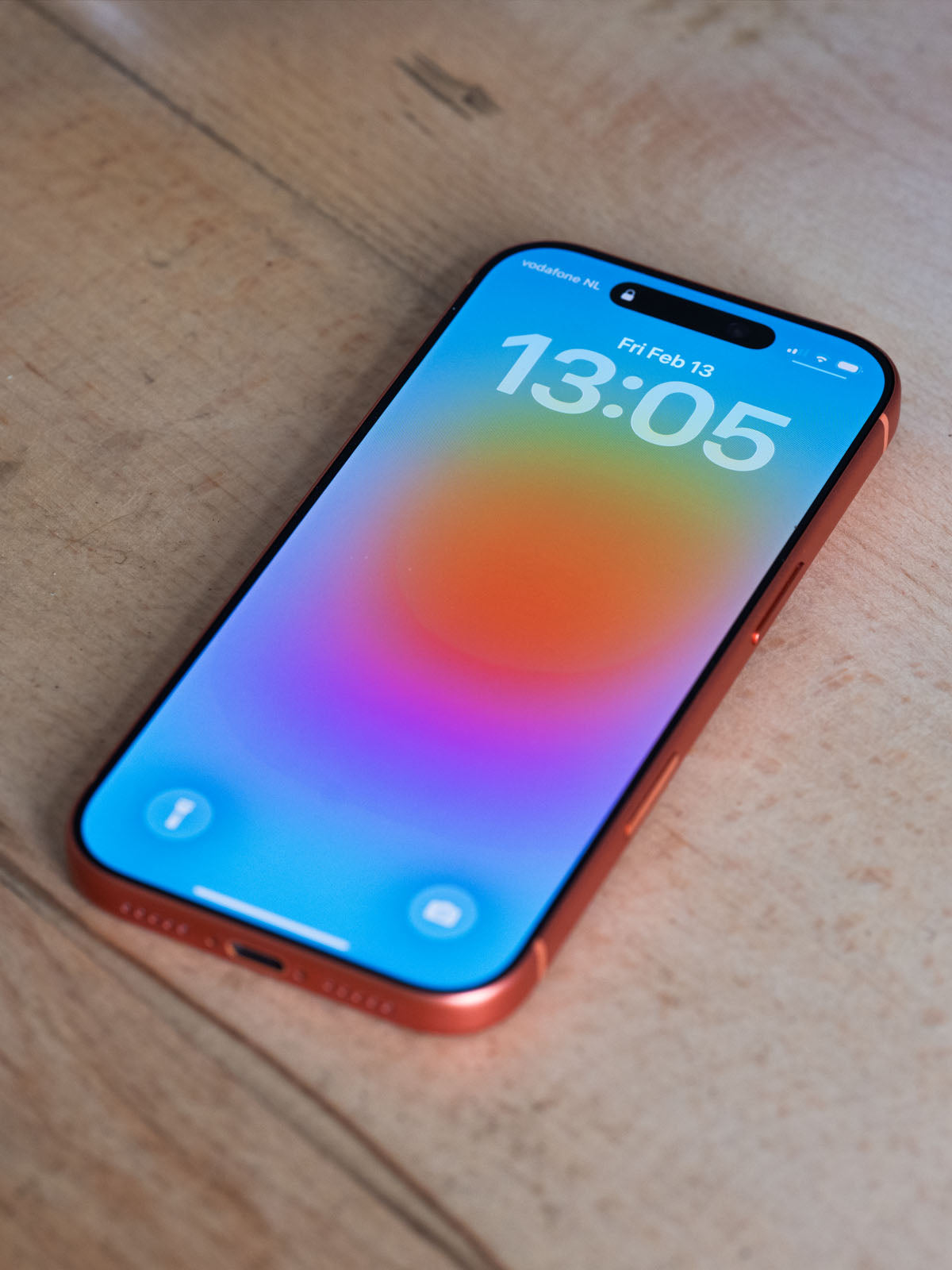
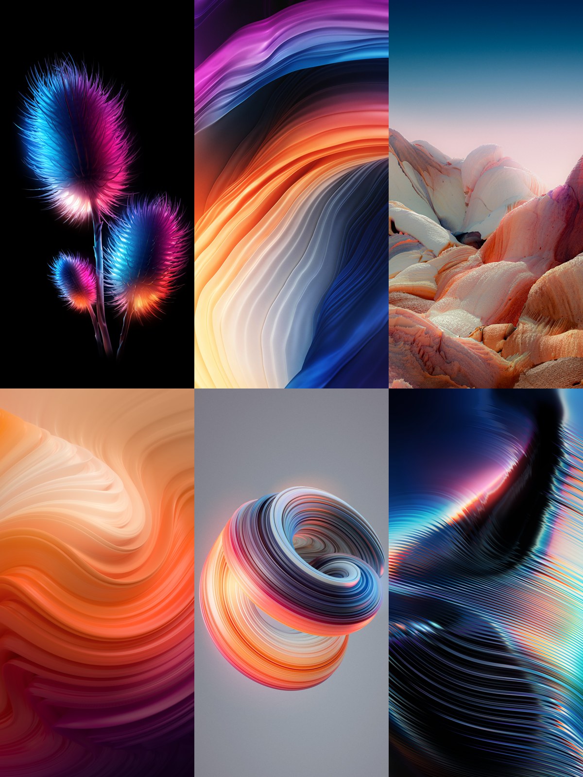
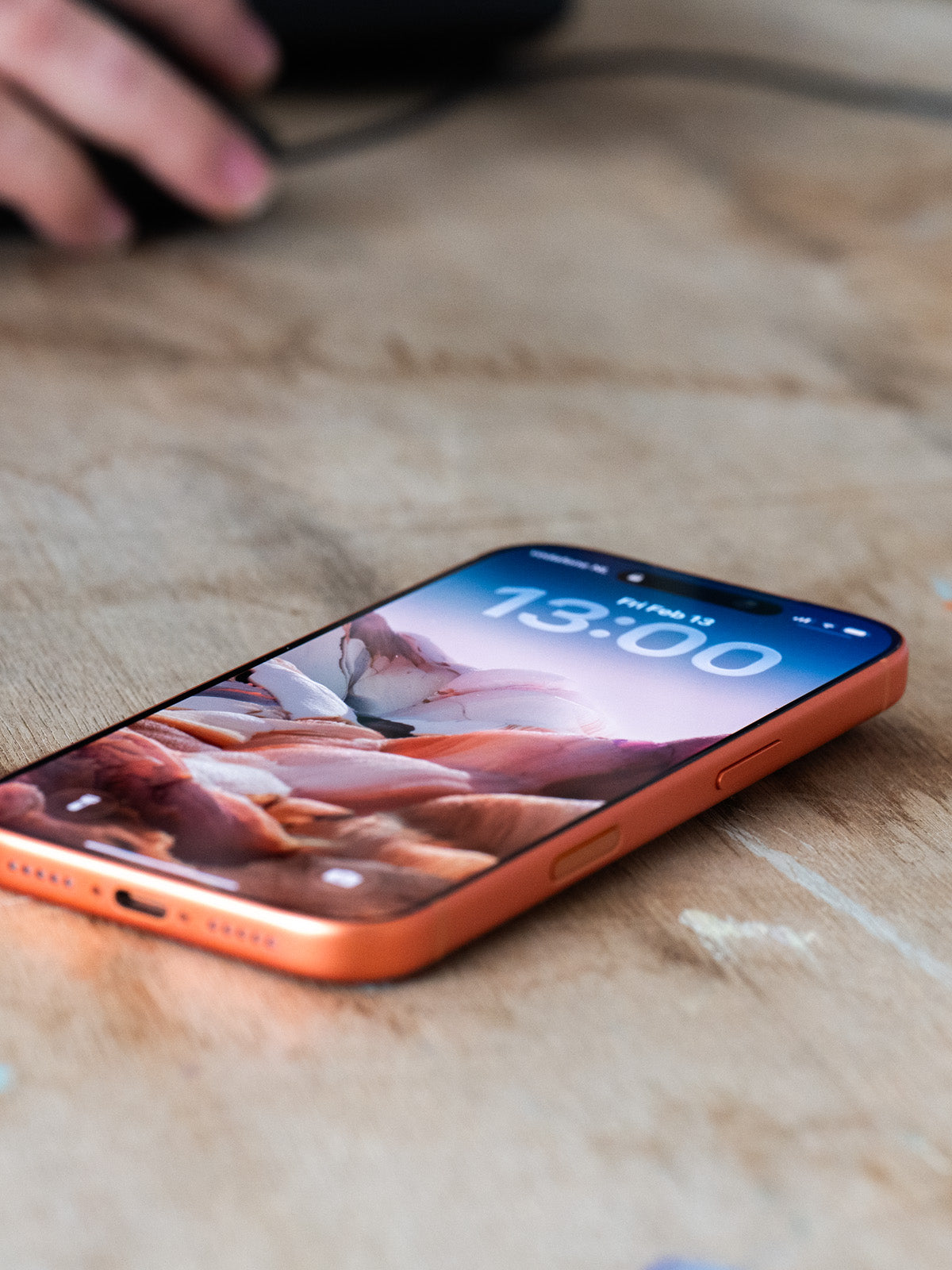
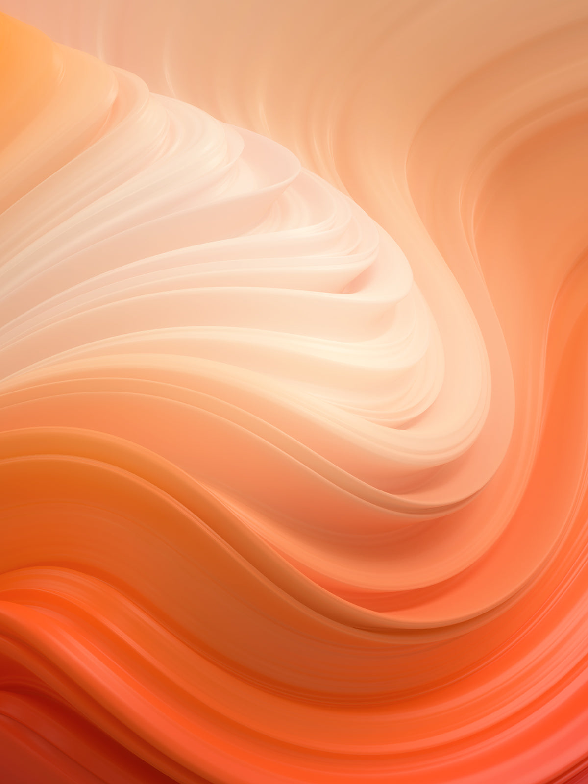
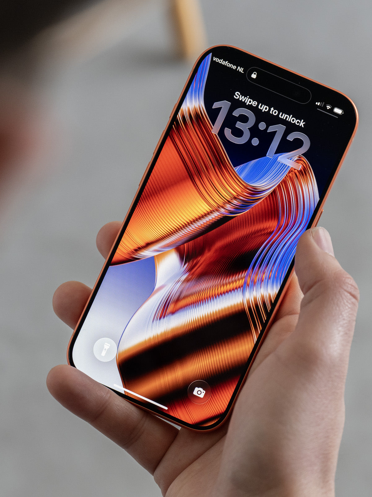
The current catalogue has three packs. Color_Therapy_001 is the most emotionally direct. Warm amber and deep coral bleed into cool blue-violet across phone-sized canvases. The transitions are smooth but not mechanical — they have weight and directionality, as though the color is moving through the frame rather than sitting flat on it. The preview shots show the work on physical phones against muted backgrounds, which is a smart presentational choice. You see immediately how the art behaves as a lockscreen rather than as an isolated design artifact.
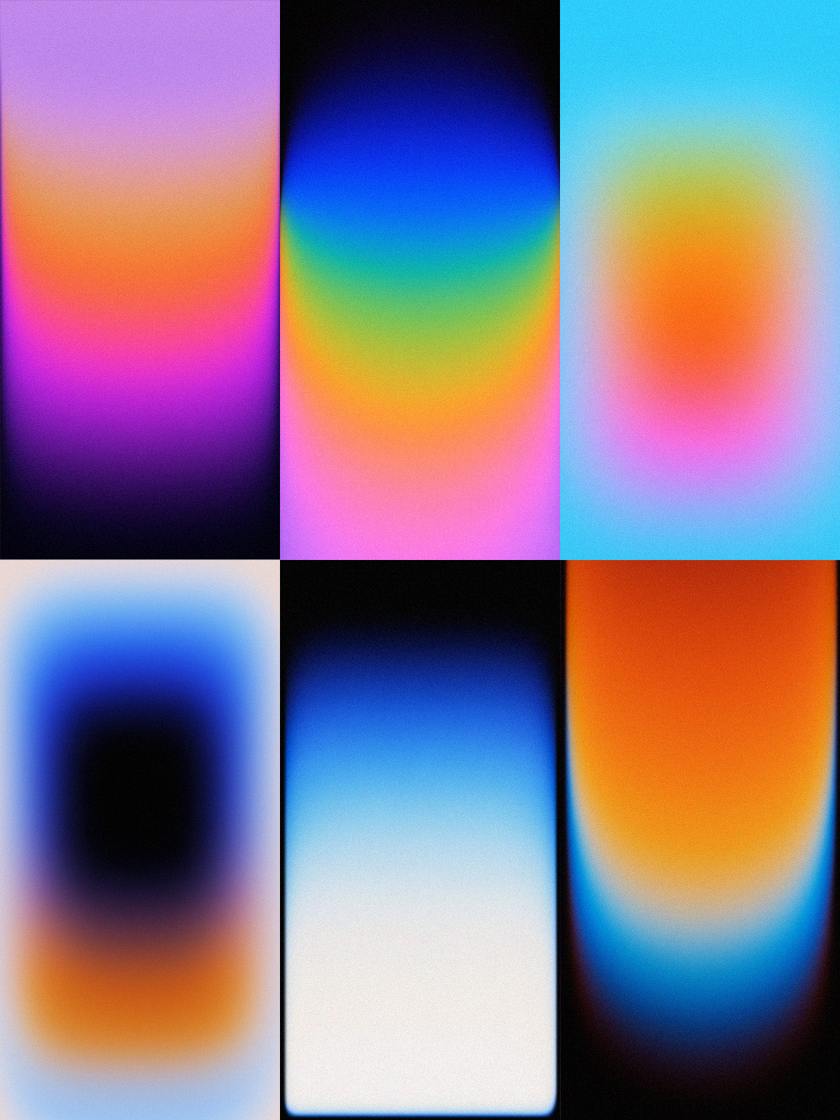
Essentials_001 pulls in a different direction. The pack positions itself as "classics from the future and the past" — a phrase that actually describes the visual register. Some compositions lean into warm earth tones and hazy transitions that read as analog and nostalgic. Others are crisper, cooler, more architectural. One preview shows a mirage-like gradient that hovers between a desert heat effect and something purely synthetic. The range within a single pack is notable: Oostenbroek is not chasing one mood but mapping a territory.
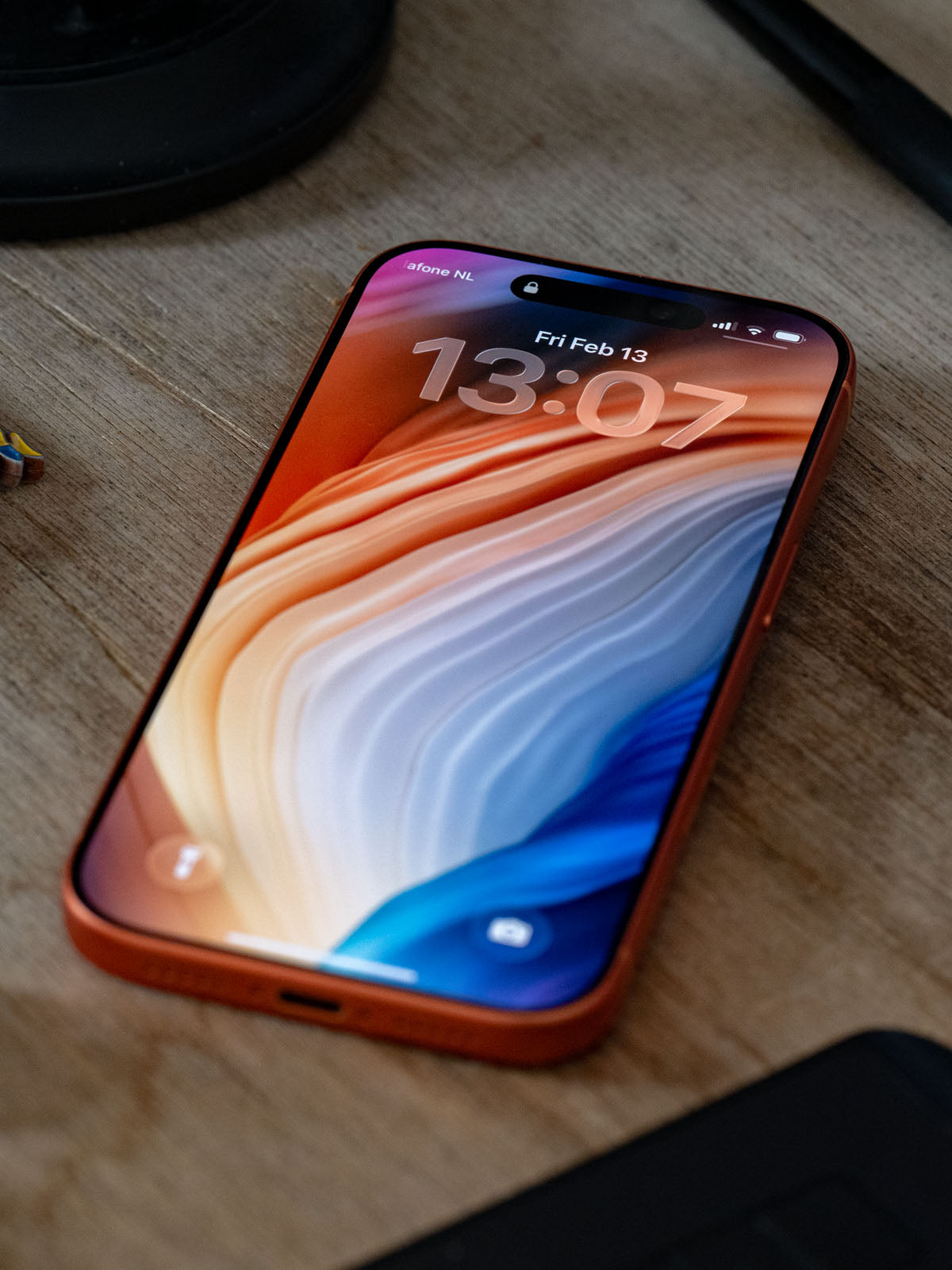
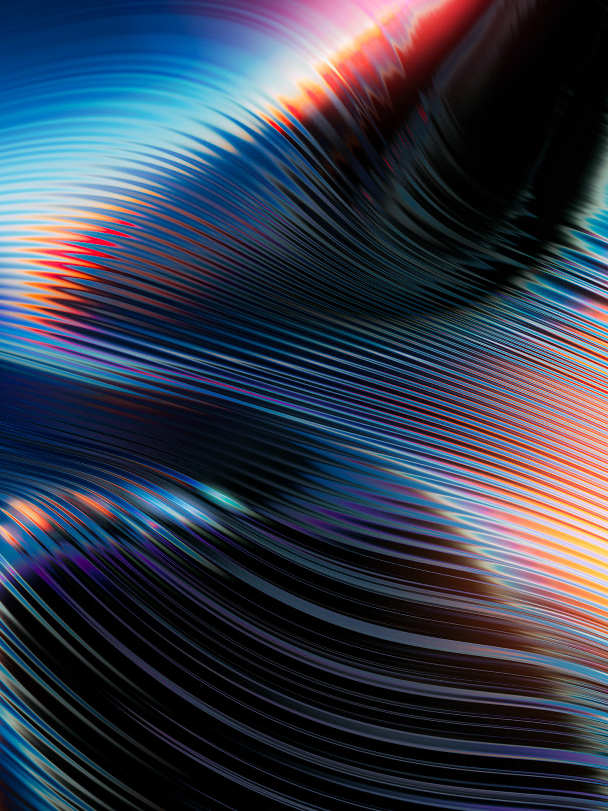
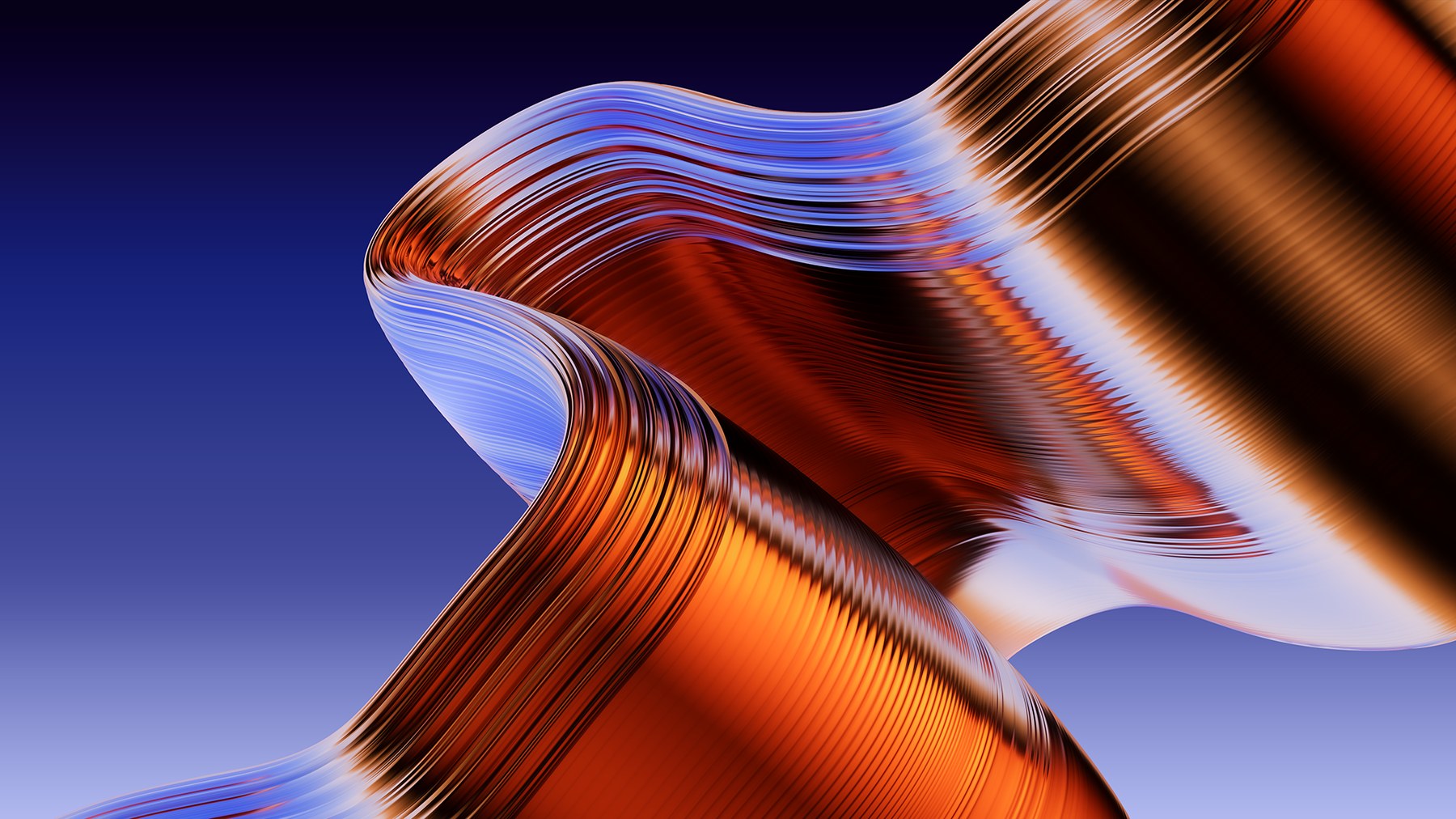
Singularity is the most technically ambitious piece in the store. It ships in multiple resolutions — 4K desktop at 3840x2160, ultrawide at 3440x1440, HD at 1920x1080, and mobile at 1440x3200 — all as high-quality PNGs. The artwork itself shows ribbon-like forms that spiral and fold across the frame. Deep orange and blue-white tones weave together with the kind of fluid precision that takes real time to achieve. The form language is abstract but not random. Each ribbon has a consistent cross-section, a consistent curvature logic. The composition holds.
The Screen as a Design Surface
What Oostenbroek is selling, beyond individual files, is a specific attitude toward the screen. Most wallpaper content treats the phone background as a placeholder — something neutral, or something flashy that quickly becomes fatiguing. His work treats it as a designed surface with its own requirements. Colors are tuned for how OLED and LCD panels actually render them. Compositions account for the status bar and the time overlay. The format is considered from the beginning.
Each pack is delivered as a personal use digital download with no DRM complications. The price points are modest — €4.99 to €8.99 — which reflects a genuine interest in accessibility rather than exclusivity. Oostenbroek also runs a free wallpaper subscription via email, described simply as "No spam — just art." That directness carries through everything about the store's presentation.
For anyone who thinks seriously about the visual environment they move through each day, this is a resource worth knowing. The work is precise, the craft is real, and the intent is clear.