Redefining Stootie through a bold and colorful rebranding

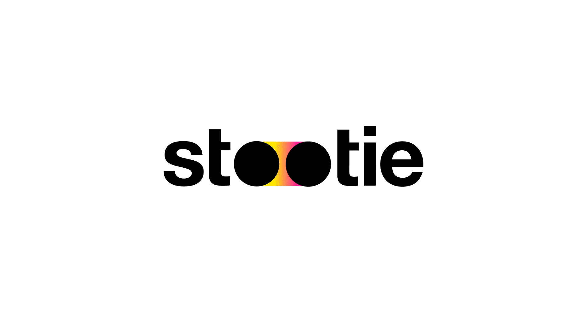
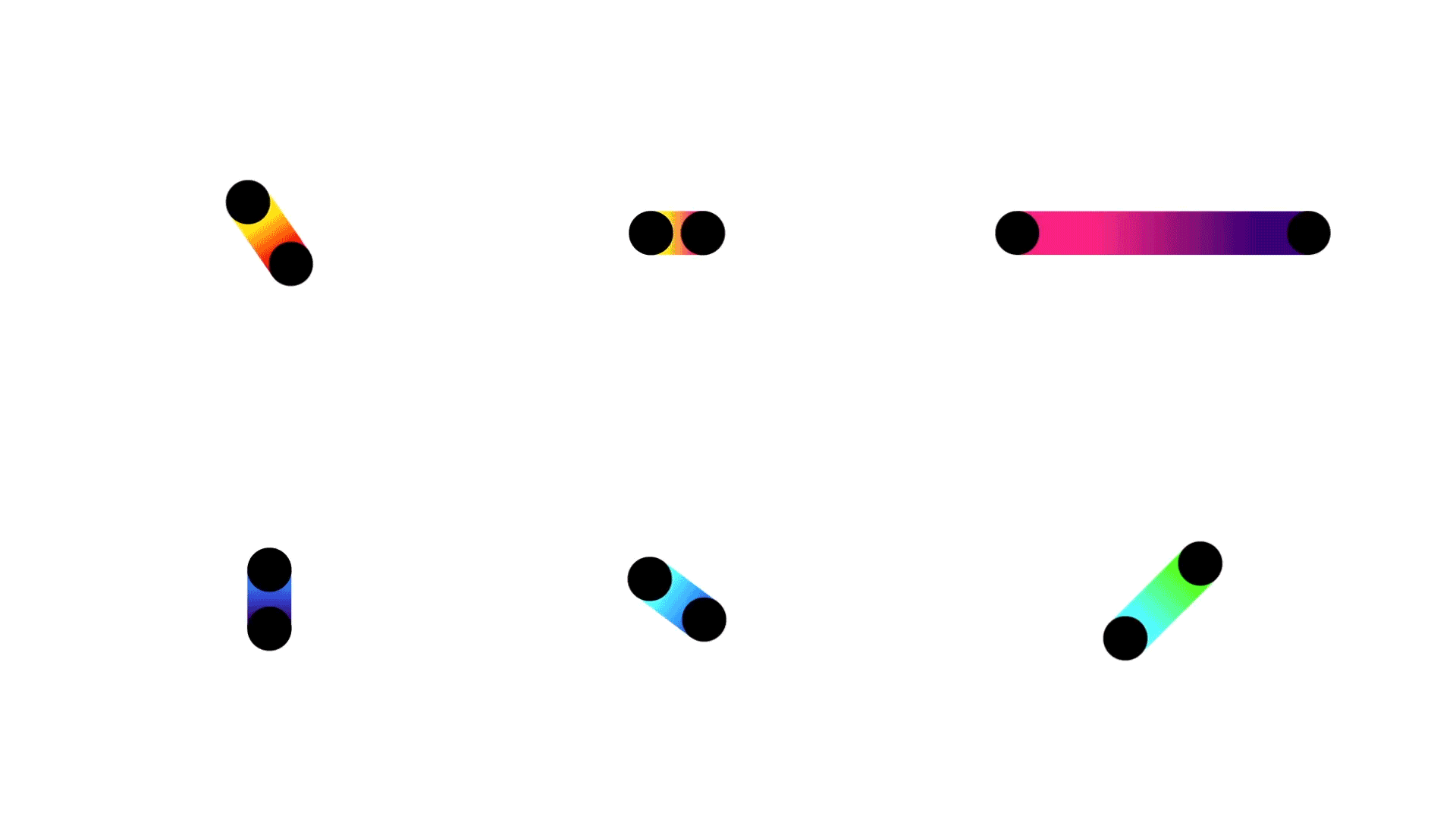
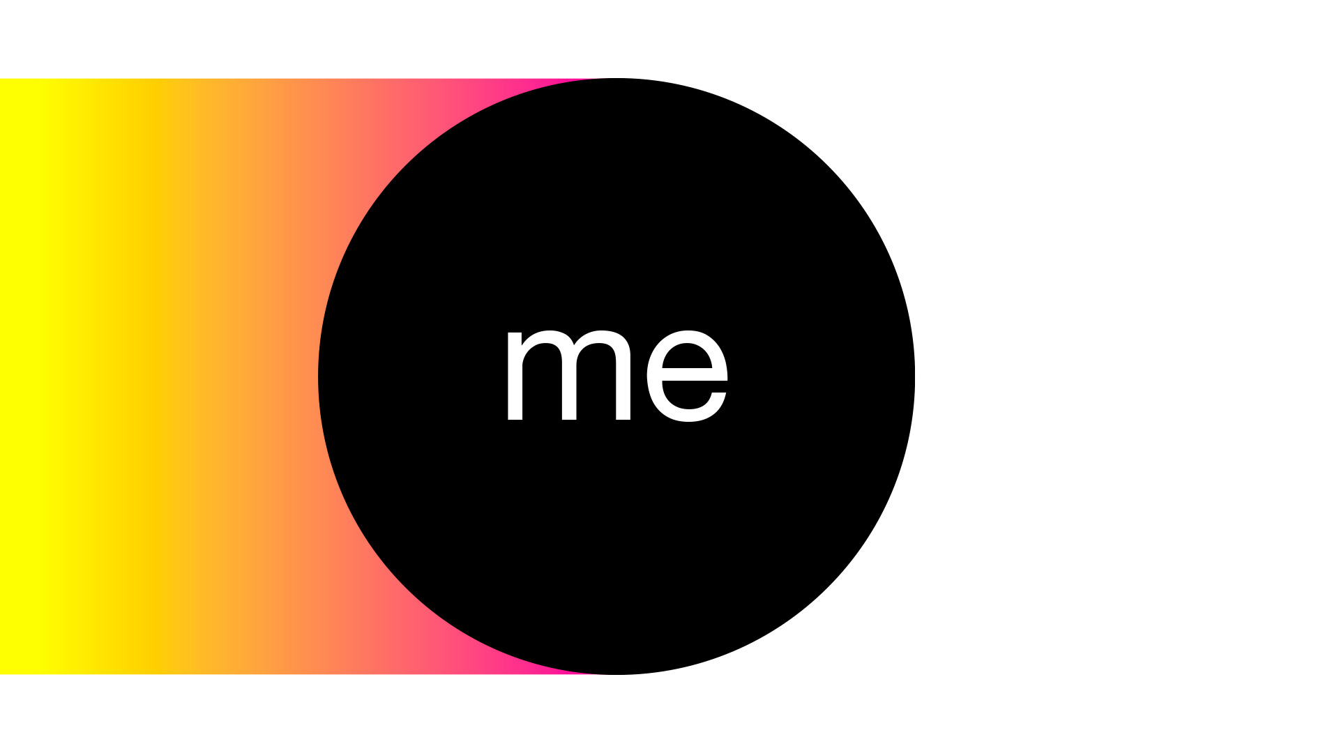
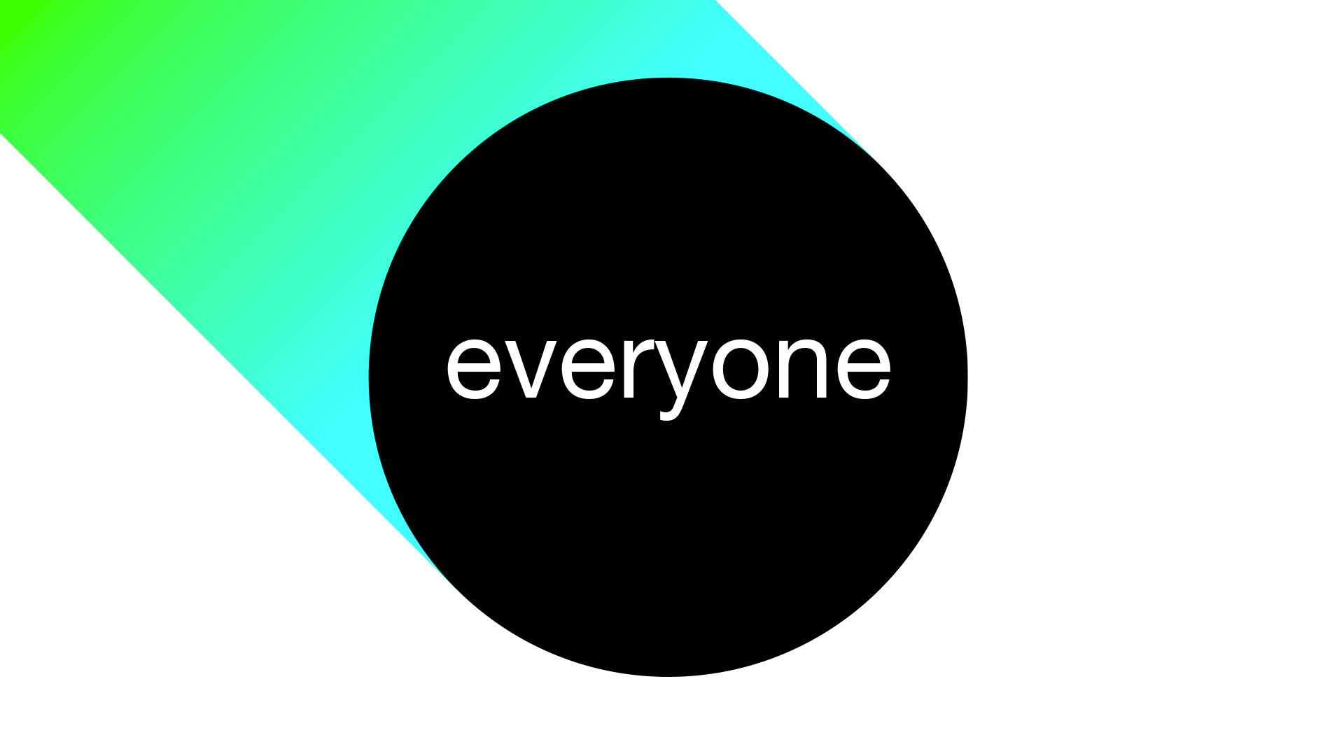
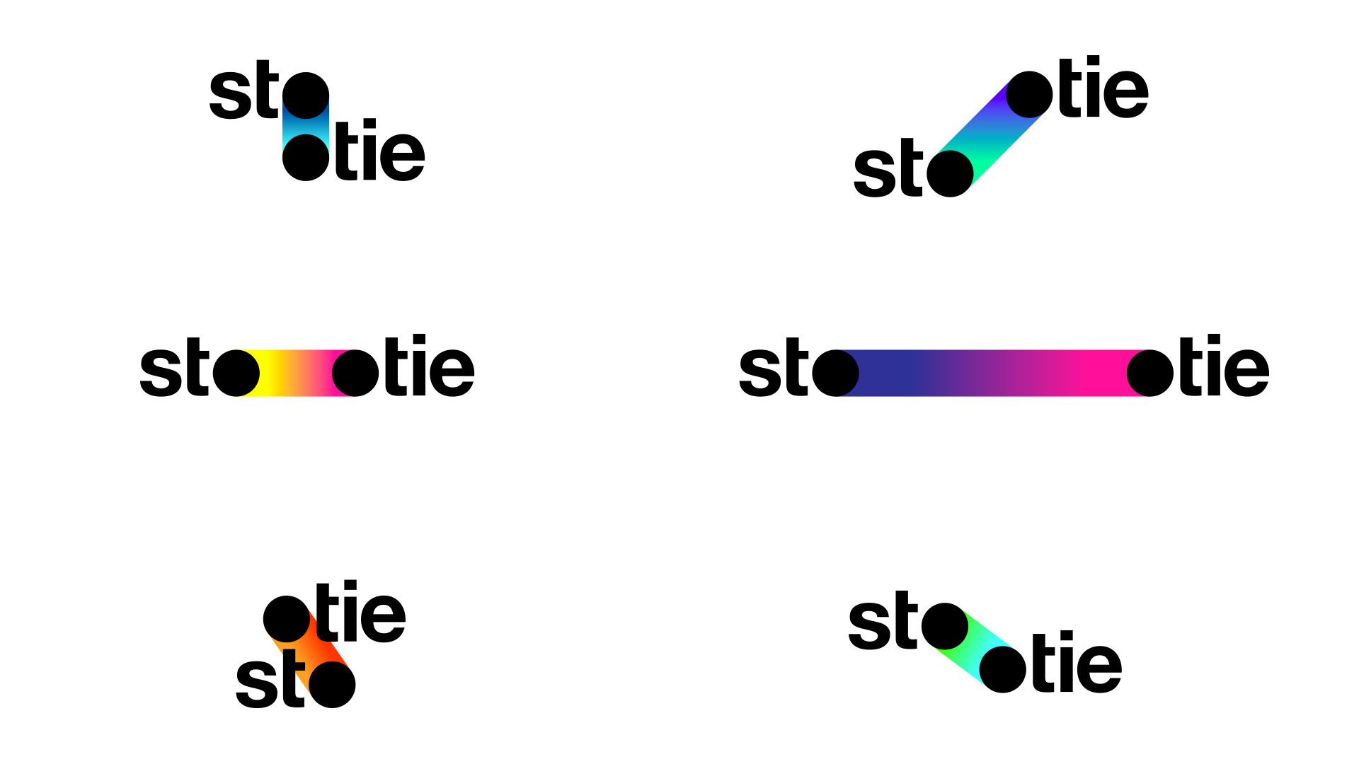
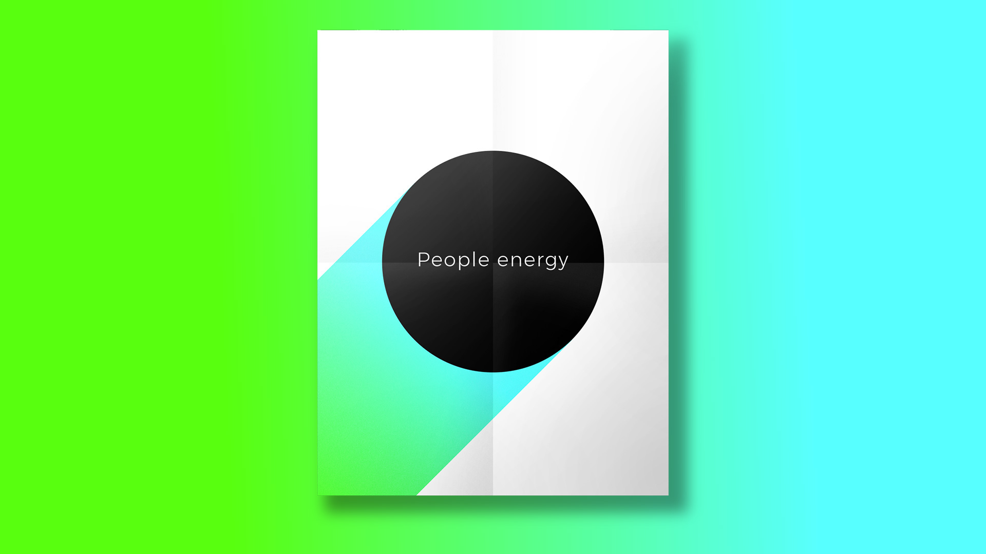
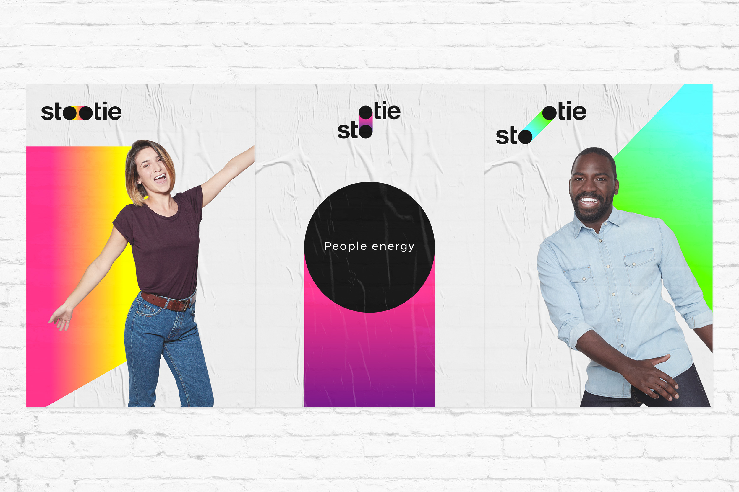
Let's take a look at this colorful rebranding by the folks from Carré Noir, it's a branding agency located in beautiful Paris, France. They have worked with Stootie to helped make a bold and evolving identity based on the theme of "people energy". Imagine having a group of individuals available to help with your daily chores from renovations, moving, deliveries and more. I love the super clever concept of the logo and seeing animated gives a total giveaway of what the brand is all about. Props to everyone involved in this project.

More Links

Redefining Stootie through a bold and colorful rebrandingRedefining Stootie through a bold and colorful rebrandingRedefining Stootie through a bold and colorful rebrandingRedefining Stootie through a bold and colorful rebrandingRedefining Stootie through a bold and colorful rebrandingRedefining Stootie through a bold and colorful rebrandingRedefining Stootie through a bold and colorful rebrandingRedefining Stootie through a bold and colorful rebrandingRedefining Stootie through a bold and colorful rebrandingRedefining Stootie through a bold and colorful rebrandingRedefining Stootie through a bold and colorful rebrandingRedefining Stootie through a bold and colorful rebranding

Get Featured

Send your project to be featured on the blog. Follow the instruction on the template and good luck. Ah, make sure you add the images and credits that are due.

Submit content