by jeff
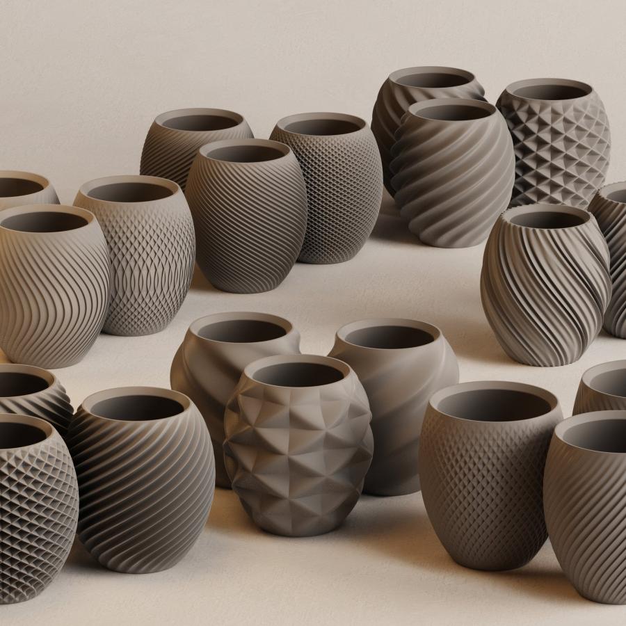
Deck.gallery curates beautiful presentation design — from pitch decks to brand guidelines treated as craft objects by studios and independents worldwide.
There is a moment every designer knows: the project is finished, the pixels are locked, and then someone asks for a deck. For a long time, that request sat in a different category — something functional, something quick, a container for the real work rather than an extension of it. Deck.gallery exists to challenge that reflex. Curated by product designer Muharrem Şenyıl, the site collects some of the finest examples of presentation design circulating on the web, making the case that a slide deck can carry the same intention and craft as any other designed artifact.
The argument behind the curation is straightforward but worth stating plainly: the work is not done when the design is done. How you package your thinking — the narrative arc, the typographic choices, the rhythm of information across slides — is itself a design decision. Studios and companies that understand this produce decks that function as both communication tools and design objects. Deck.gallery puts those examples in one place, drawing from pitch decks, brand guidelines, annual reports, trend studies, and agency credentials spanning a wide range of industries and visual approaches.
What strong presentation design actually looks like
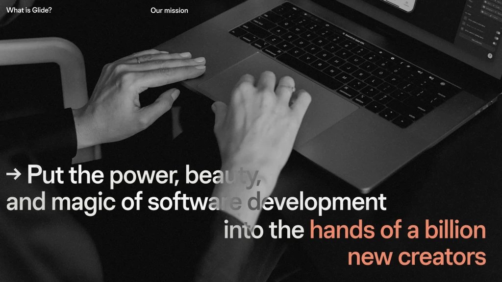
Among the decks featured on the site, Glide's brand guidelines stand out for their restraint and confidence. The deck opens on a full-bleed black-and-white photograph — hands hovering over a laptop — with a mission statement cascading in left-aligned text, one phrase picked out in a warm coral accent against the monochrome field. The typographic hierarchy is handled with precision: a single weight of a clean sans-serif does all the heavy lifting, and the color break carries exactly the emotional weight it needs to. It is presentation design that functions like editorial layout.
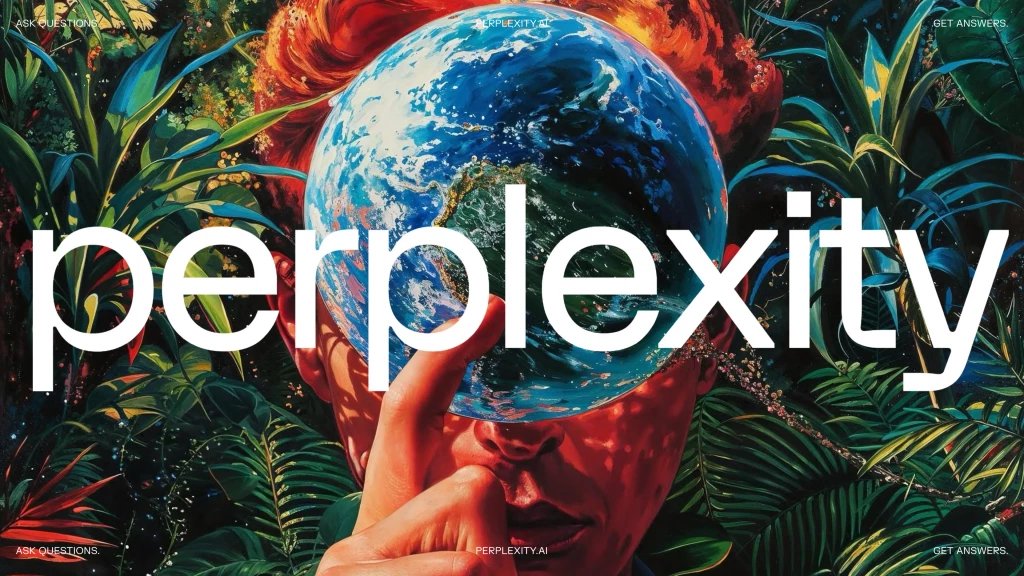
Perplexity's 2024 ads pitch deck takes the opposite approach — maximalist, painterly, almost baroque. The cover sets a large, lowercase geometric wordmark over a full-bleed digital illustration of a figure holding a globe amid tropical foliage, warm reds and deep greens saturating the frame. Corner text in small caps creates a symmetrical poster structure. The effect is closer to an album cover than a corporate slide, which is precisely the point: the presentation design carries the brand's ambition before a single data point appears.
SpaceX's "Making Life Multiplanetary" deck, originally from 2016, shows what happens when presentation design commits fully to a visual argument. One slide presents nothing but a cinematic rendering of a lone human silhouette standing before a triangular observation window, Mars burning amber outside. No text. The composition is symmetrical, Kubrickian, and deliberately still. It is a slide that asks the audience to feel something before it asks them to understand something — a sequencing choice that reveals real craft in the construction of the deck.

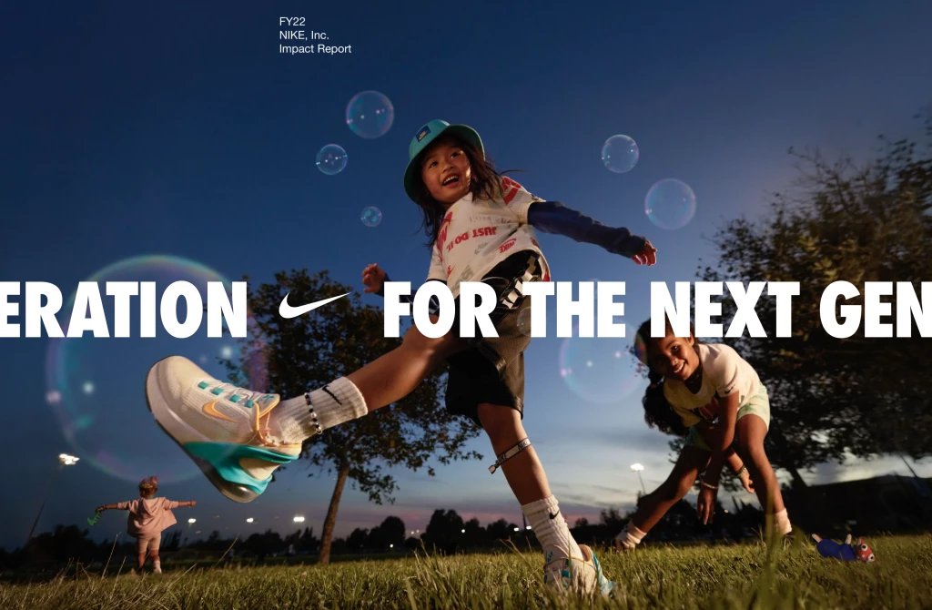
Nike's FY22 Impact Report demonstrates that annual reports can carry the same energy as campaign work. A twilight photograph of a child mid-kick, soap bubbles floating through the dusk light, anchors a cover that bleeds joy and movement. The condensed sans-serif type running across the bottom — "FOR THE NEXT GENERATION" — lands with the force of a Nike campaign tagline rather than a compliance document. The presentation design here is inseparable from brand identity work.
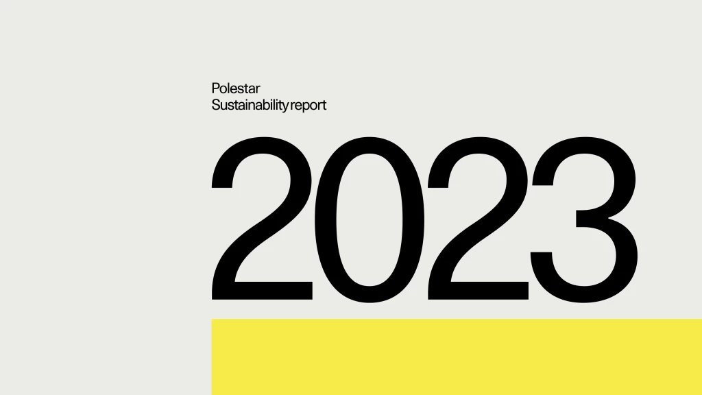
Polestar's 2023 Sustainability Report goes in a completely different direction. The cover is text-only: a warm off-white ground, the year "2023" set enormous in a geometric sans-serif, a single yellow bar running across the bottom edge. Three colors, two text sizes, no photography. The Scandinavian restraint communicates more confidence than a dozen visual flourishes would. This kind of presentation design trusts the reader and trusts the grid — an increasingly rare quality.
Beyond these individual examples, what Deck.gallery captures as a collection is a shared attitude: that slides are worth doing properly. The site also features work from Zapion Design Studio, whose agency credentials deck shows how smaller independents bring genuine visual ambition to their pitch materials. It's Nice That's collaboration with Adobe on a creative industry report demonstrates that editorial illustration and data presentation are not opposites. The Detroit Institute of Arts brand guidelines show that cultural institutions can produce deck work that matches the rigor of their collection standards.
The site is free to browse and free to submit to. Şenyıl reviews every submission personally, and only a fraction make the cut. That curatorial pressure is the point — Deck.gallery is useful precisely because it is selective. Designers looking to sharpen their own presentation design work, or clients trying to understand what good looks like, will find in it a reference library that takes the form seriously.
Credits: Decks curated by Deck.gallery / Muharrem Şenyıl. Images via deck.gallery.