by ibby
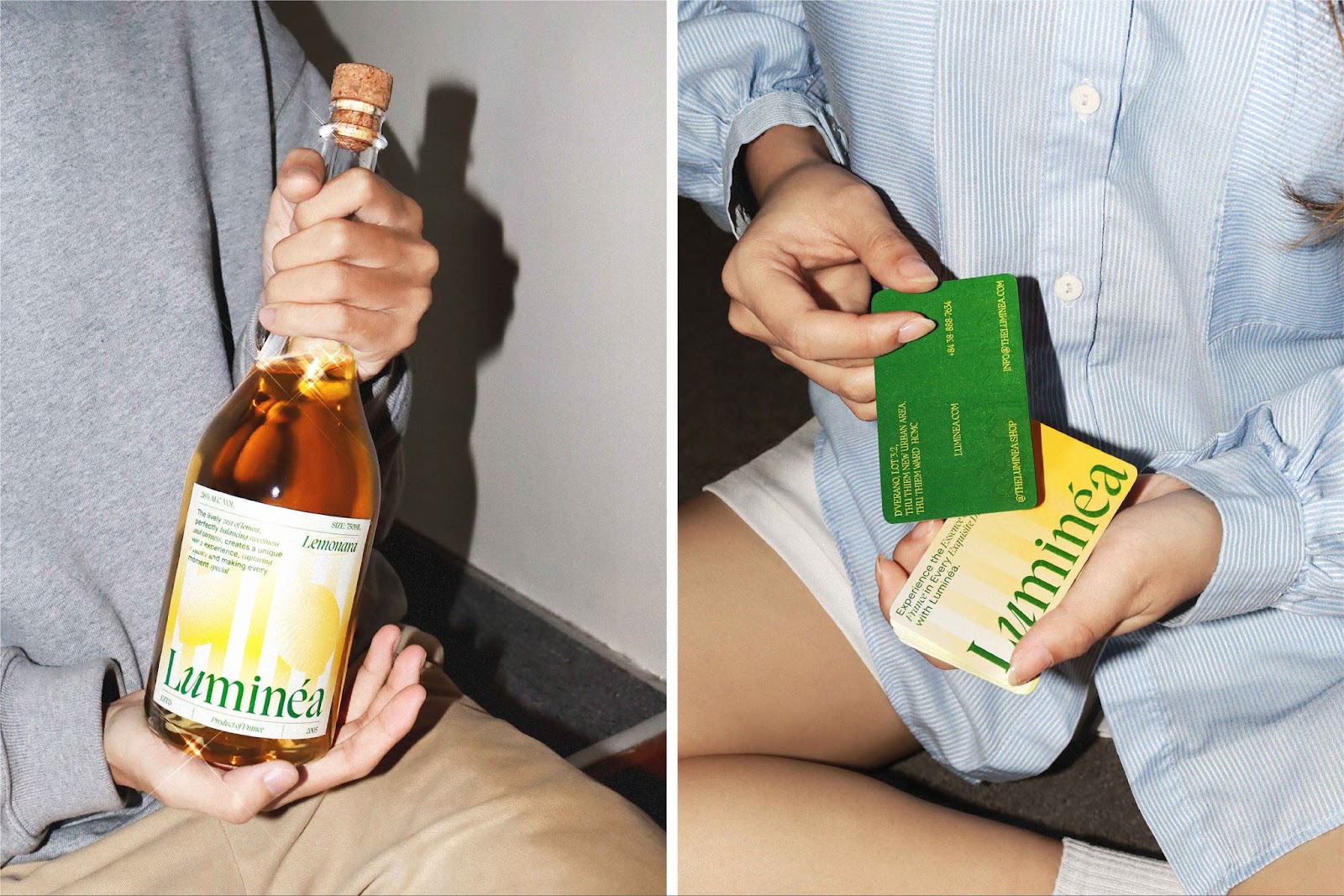
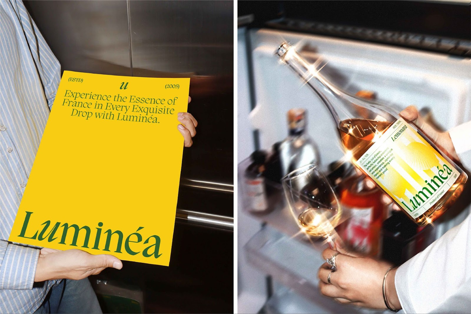
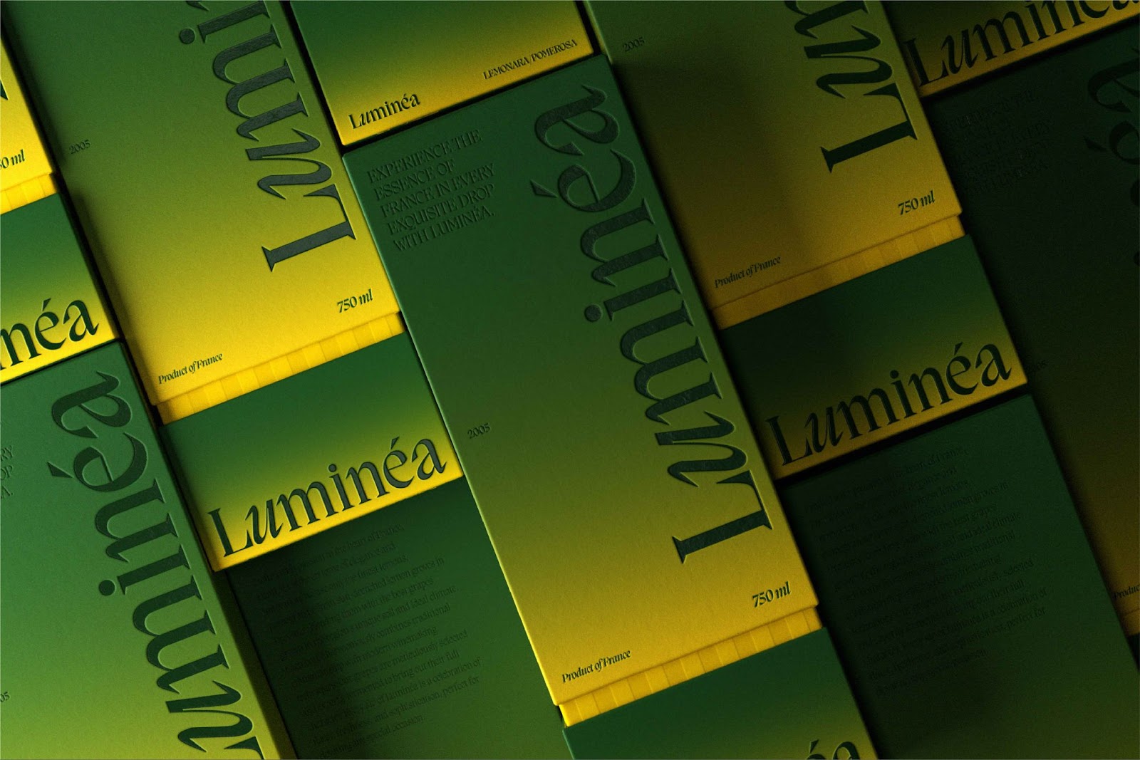
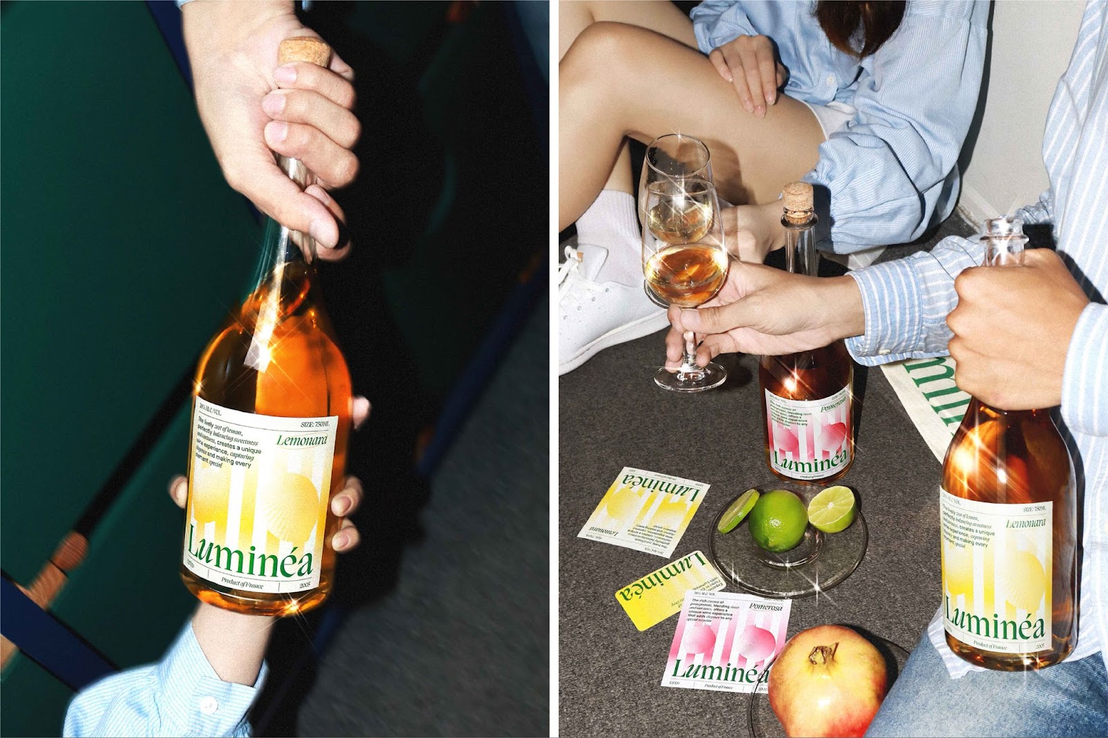
Luminéa is a wine brand designed for a new generation of French drinkers—bright, youthful, and refined. The branding name, rooted in the French word for “light,” evokes sunshine, energy, and an uplifting experience with every pour.
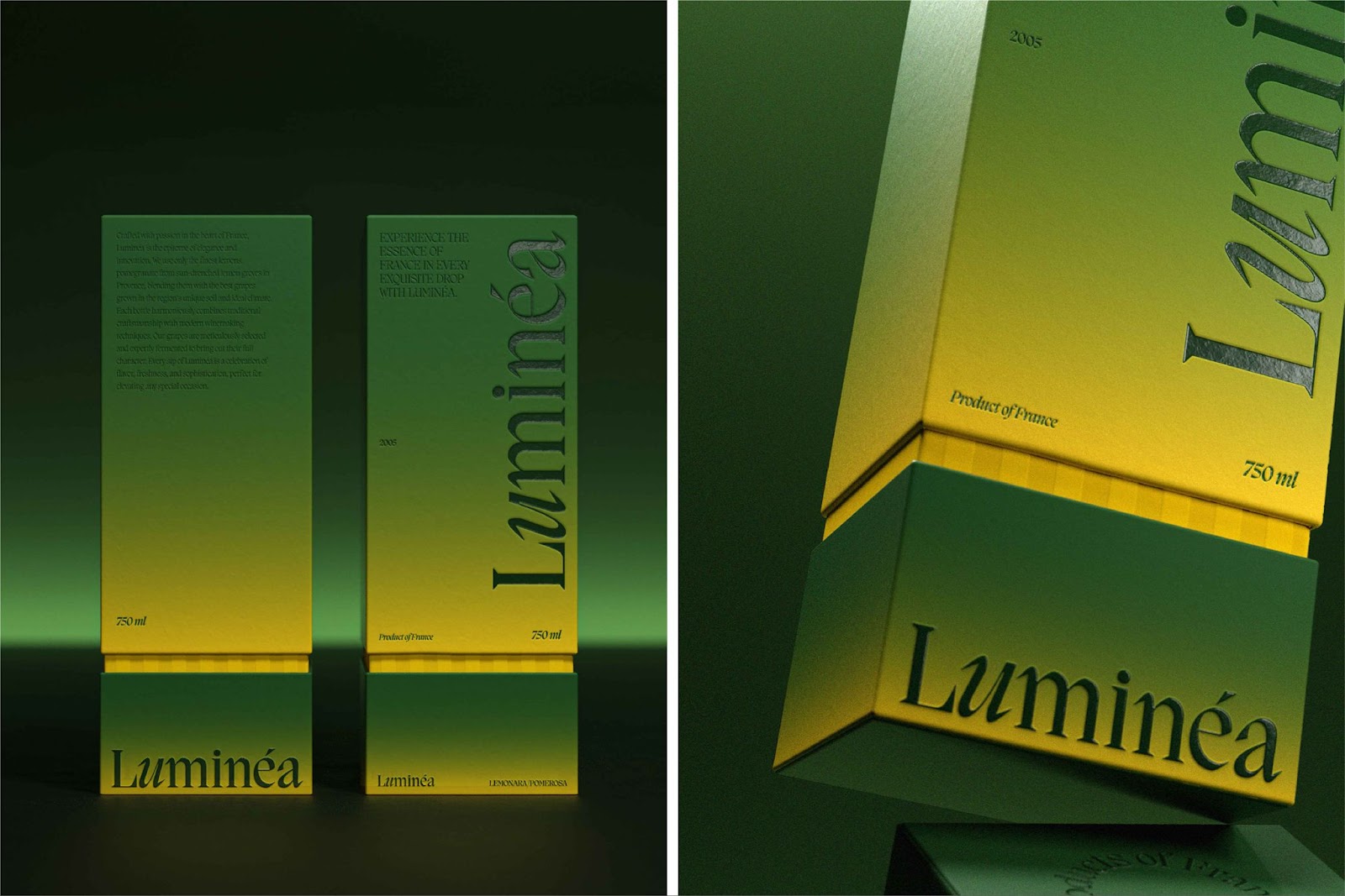
Created by Ho Chi Minh City–based studio Anothern Creative, the identity blends European elegance with a fresh visual twist. Anothern is known for building bold, clear brand systems, and their work on Luminéa is no exception. The team found inspiration in architectural awnings, rustic wine barrels, and sunlit terraces to shape a visual world that feels both rooted in tradition and built for modern shelves.
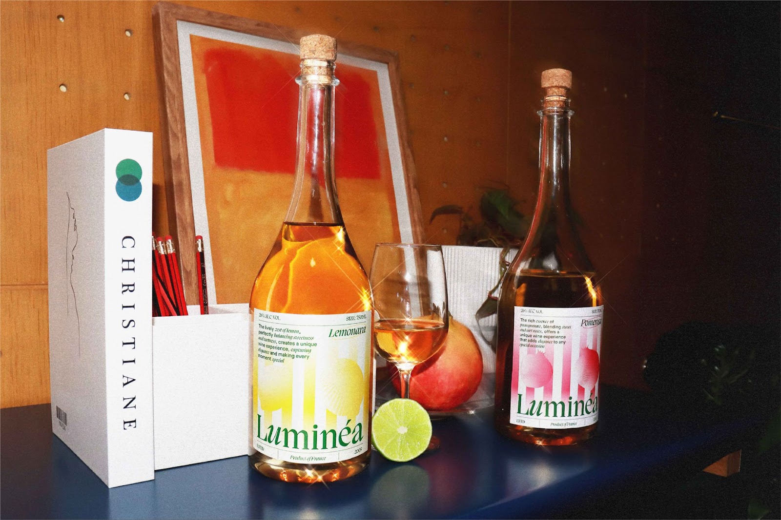
The color palette is vibrant but soft—think golden-hour gradients and subtle shadows. Clean lines and strong contrasts make the bottles pop in retail environments, while the structural references nod to heritage. The result is a brand that feels elevated yet accessible, radiant yet grounded.
At its core, the challenge was finding the balance between timeless and trendy. Luminéa succeeds by staying minimal in form, rich in feeling, and clear in storytelling.
For those interested in how contemporary branding can reimagine classic products, Luminéa is a glowing example—proof that with the right design language, even a centuries-old category like wine can speak to a new audience with clarity and style.
Explore Branding Artifacts