by sofia
DADA Projects designed the Made in Europe brand identity design to feel timeless: softened stars, Helvetica, and a dual label system spanning industries.
Europe is the world's largest exporter of goods and services. Yet the ethical, environmental and innovation standards behind those goods remain largely invisible to consumers. The Made in Europe Blueprint, developed by think tank 21st Europe, aims to change that. The identity system was designed by female-led studio DADA Projects, founded by Creative Director Christina Worner.
The challenge was unusual. The studio needed a mark capable of representing 700 million Europeans across sectors as different as robotics and wine production. It had to feel neither institutional nor rootless. DADA's process began by deliberately moving away from traditional symbols, testing whether European values could be communicated without relying on them. Ultimately, the team recognised that the stars and blue carried too much built-in trust to discard.
The result keeps the classic star arrangement but softens it. Rounded edges on the 'e' letterform give the logo a human quality, distancing it from bureaucratic rigidity while preserving the credibility a certification mark demands. "We wanted to make a mark that felt instantly familiar at a glance, while clearly standing as something new," Worner notes.
The typography reinforces those values. DADA selected Helvetica, a choice the studio framed as an assertion that design itself is a distinctly European value. Its neutrality allows the label to move across industries without favoring any particular aesthetic. The deep blue palette draws on the EU flag but refreshed to read as contemporary rather than dated.
The Dual Label System at the Core of the Brand Identity Design
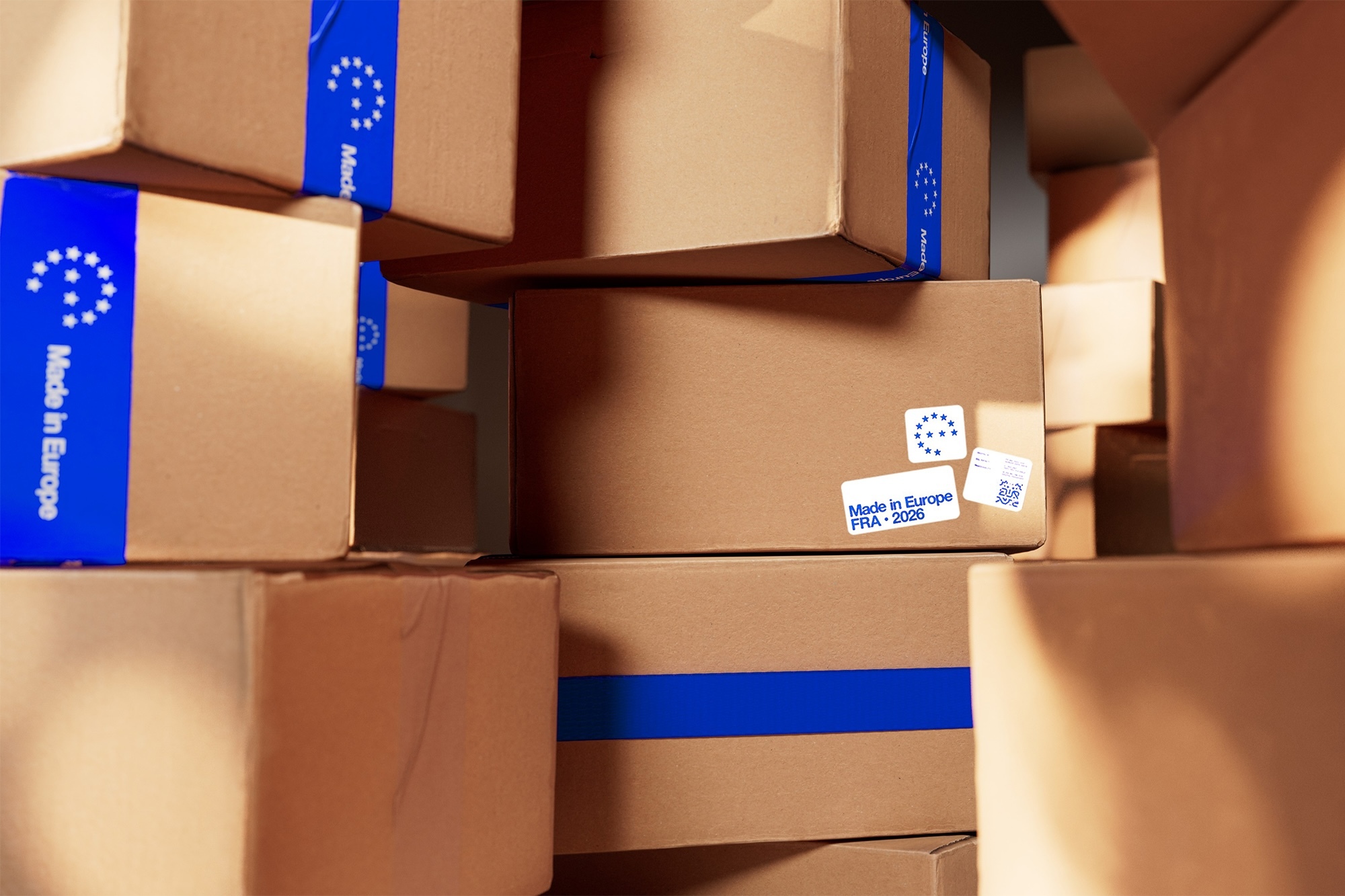
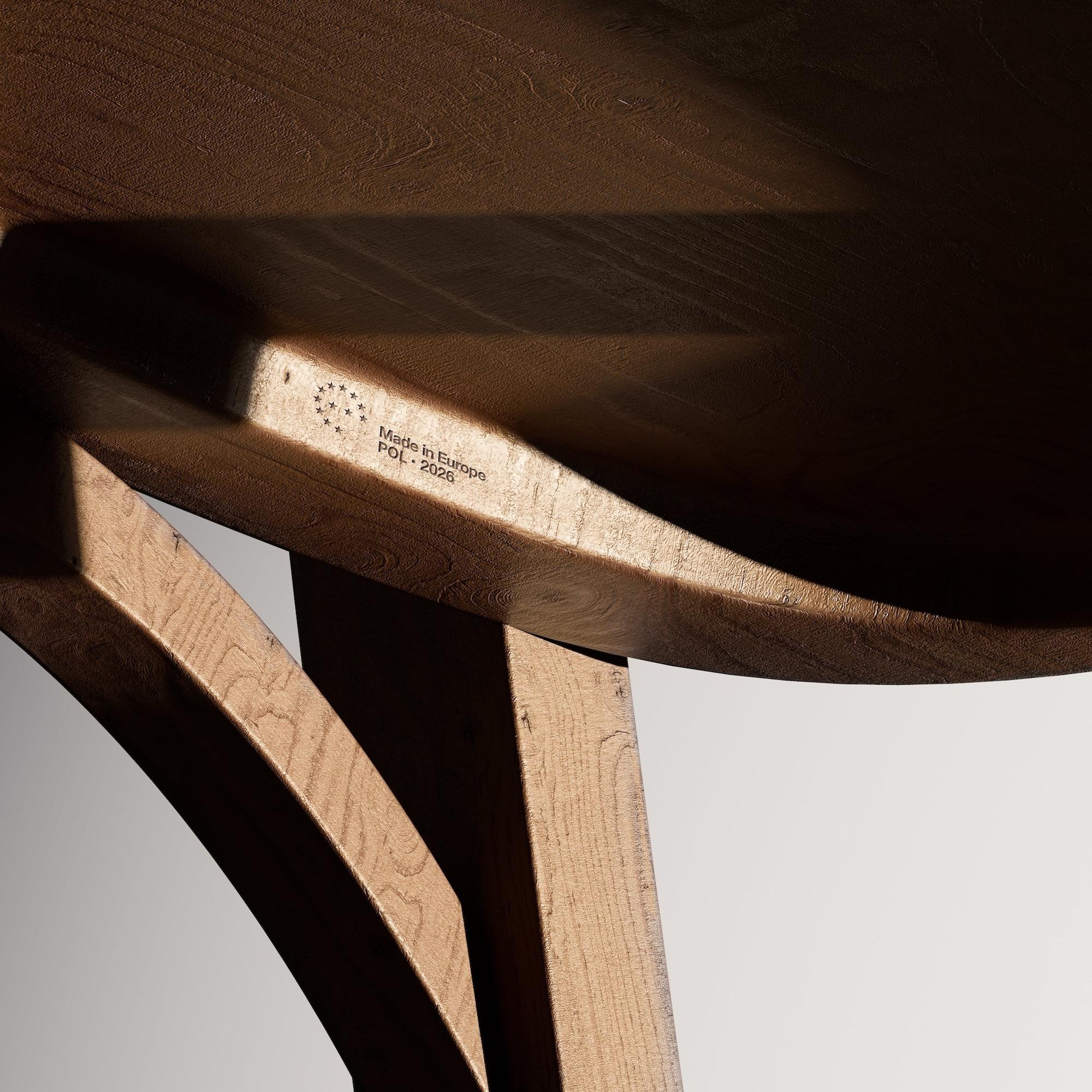
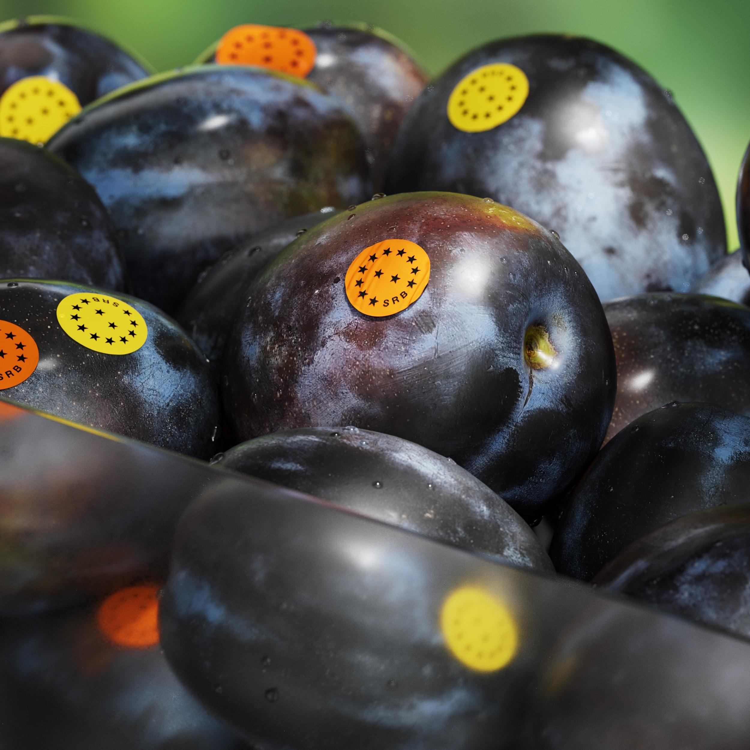
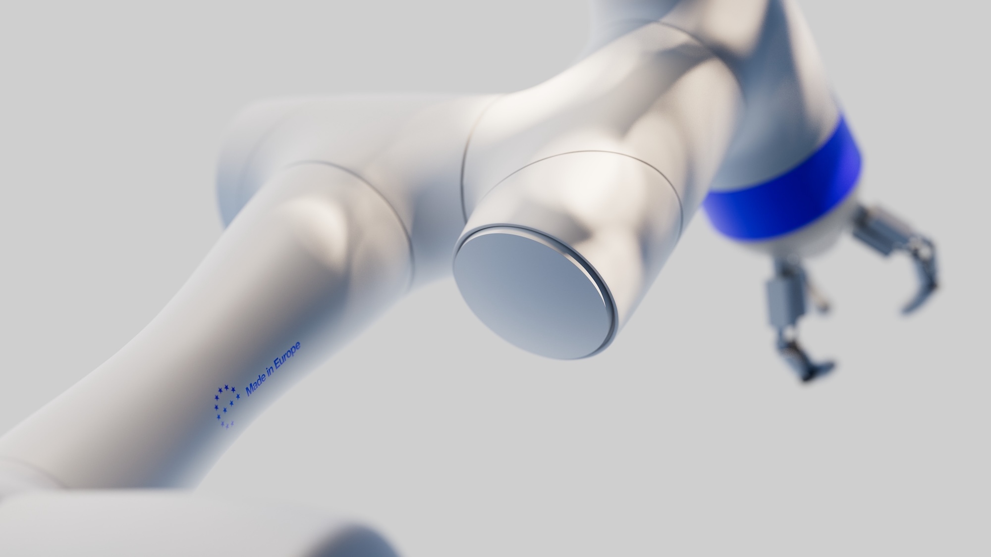
The identity splits into two complementary label directions. Industrial applications use rectangular forms, referencing machinery and equipment. Consumer products receive rounded shapes that adapt to curved or irregular surfaces. Both perform across scales, from a wine bottle neck to a robotic arm.
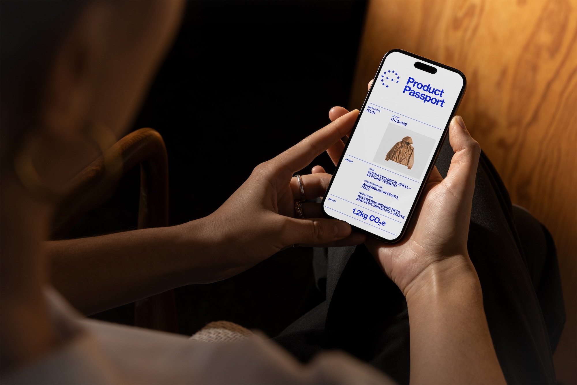
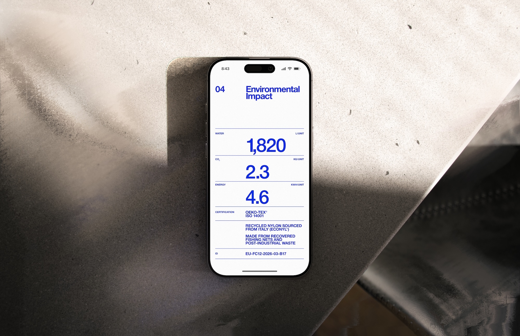
A custom QR code, designed to feel integral rather than added on, links to supply chain transparency data. Scanning reveals supply chain journeys, recycling information, and labour standards. The QR was tested across approaches from standard to experimental, landing at a point that reads as both designed and clearly functional.
The campaign imagery grounds the brand identity design in context: 3D renders combined with stock photography place the mark on actual products, from offshore wind turbines to wearable health devices. The work was unveiled alongside Startup Guide at Web Summit in Lisbon, marking 21st Europe's first economic blueprint and the beginning of a certification system intended to make European values as visible as the goods themselves.