by jeff
Clever Lemons crafted The Alpha Men brand identity from the ground up, turning a grooming webshop into an inclusive men's lifestyle brand with bold type.
The project, a year-long collaboration between Clever Lemons and RTRN, tackled a specific cultural problem: how to rebrand a men's grooming e-commerce business without leaning on tired alpha male tropes. The result repositions The Alpha Men as a modern lifestyle brand — one that embraces diversity, authenticity, and a genuinely relaxed take on masculinity.

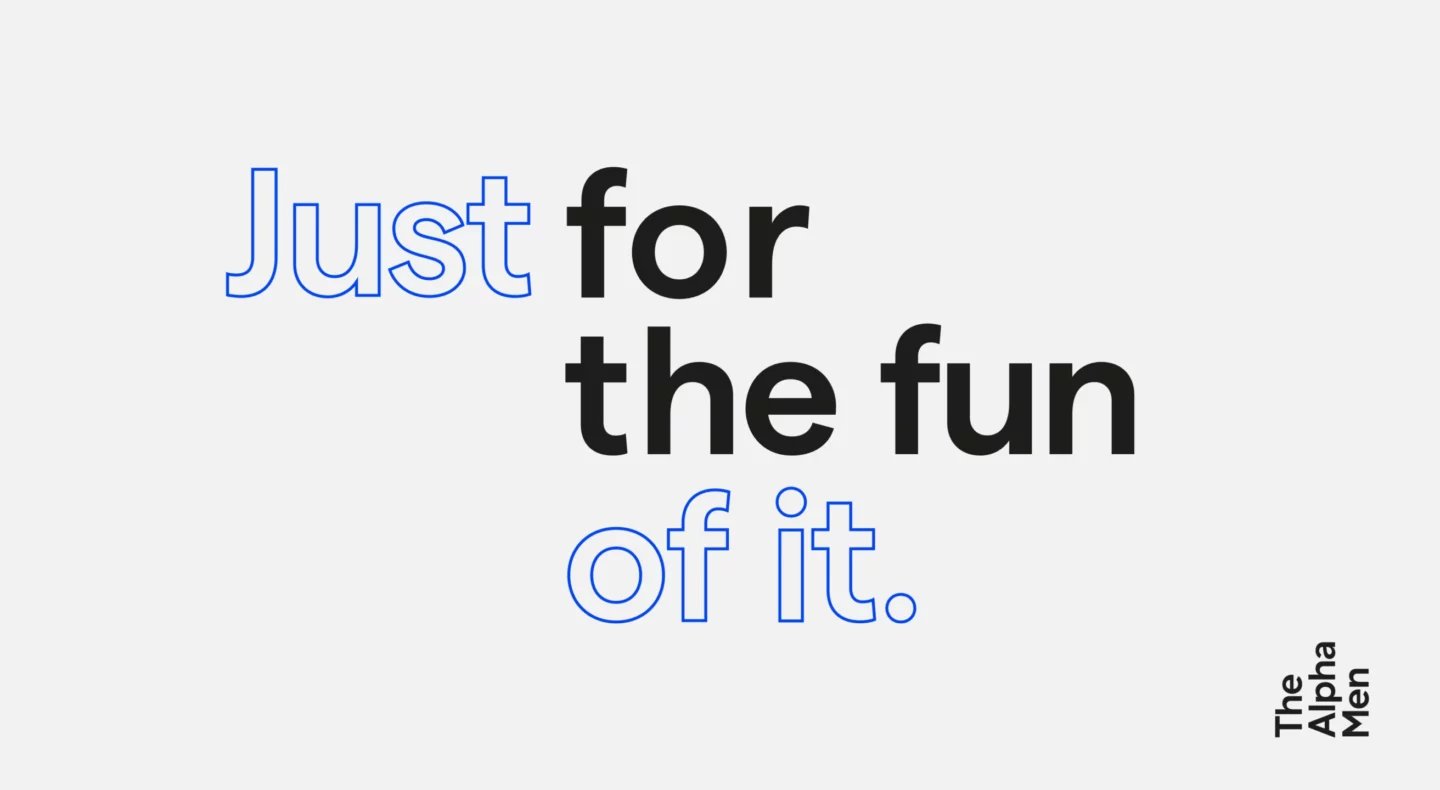
The brand identity system is built on bold, confident typography that carries the brand's tone without needing to shout. The type choices feel direct and contemporary, sitting comfortably across both print and digital applications. This consistency is deliberate — every touchpoint from tote bags to billboard shelters reads as part of the same visual language.
Brand Identity That Scales from Packaging to Web Design
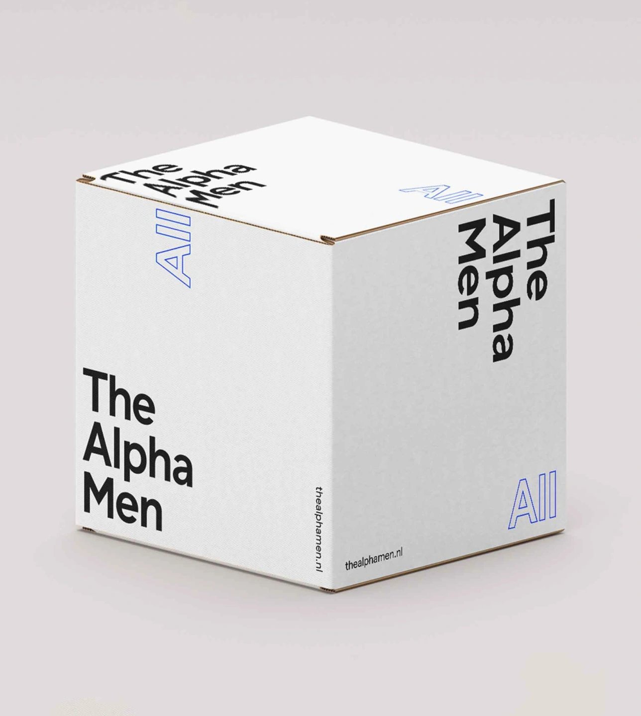
The packaging design is one of the clearest expressions of the brand identity. Clean structures, minimal ornamentation, and a considered color palette make the product boxes feel premium without being cold. The packaging cube mockups show how the identity holds up in three dimensions — the brand mark and typographic elements translate cleanly to folded surfaces, which is a real test of a logo system's strength.
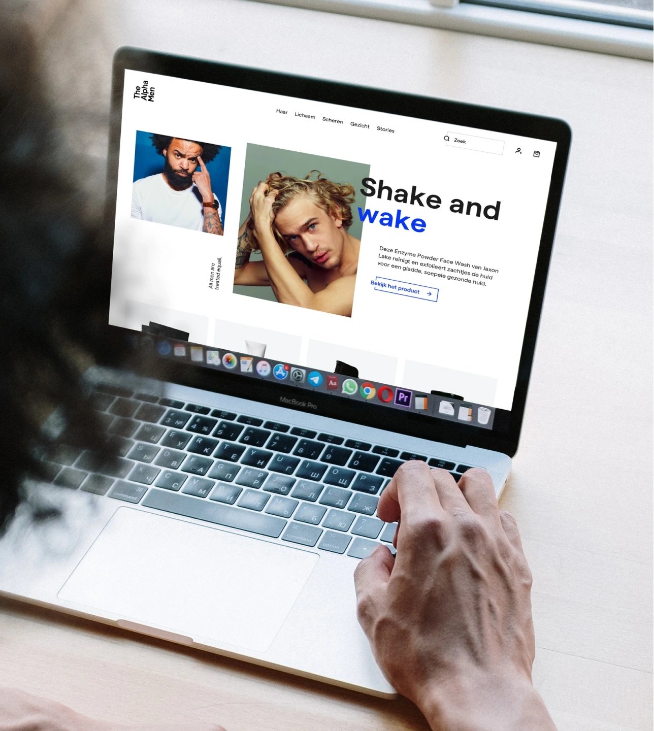
The web design component extends the same logic into digital. The e-commerce interface is clean and easy to scan, with the brand's typographic system driving hierarchy instead of decorative flourishes. Social media templates maintain the same restraint — graphic, bold, and immediately recognizable as part of the same brand identity.
Clever Lemons and RTRN built something genuinely coherent here. The brand identity for The Alpha Men works because it commits to a single visual register and applies it with discipline across every surface — from a folded packaging box to a full website layout.


