by abduzeedo
Buro Reng built a flexible brand identity for GROOW Active Spaces — a Dutch experiential learning platform that teaches through doing, not just watching.
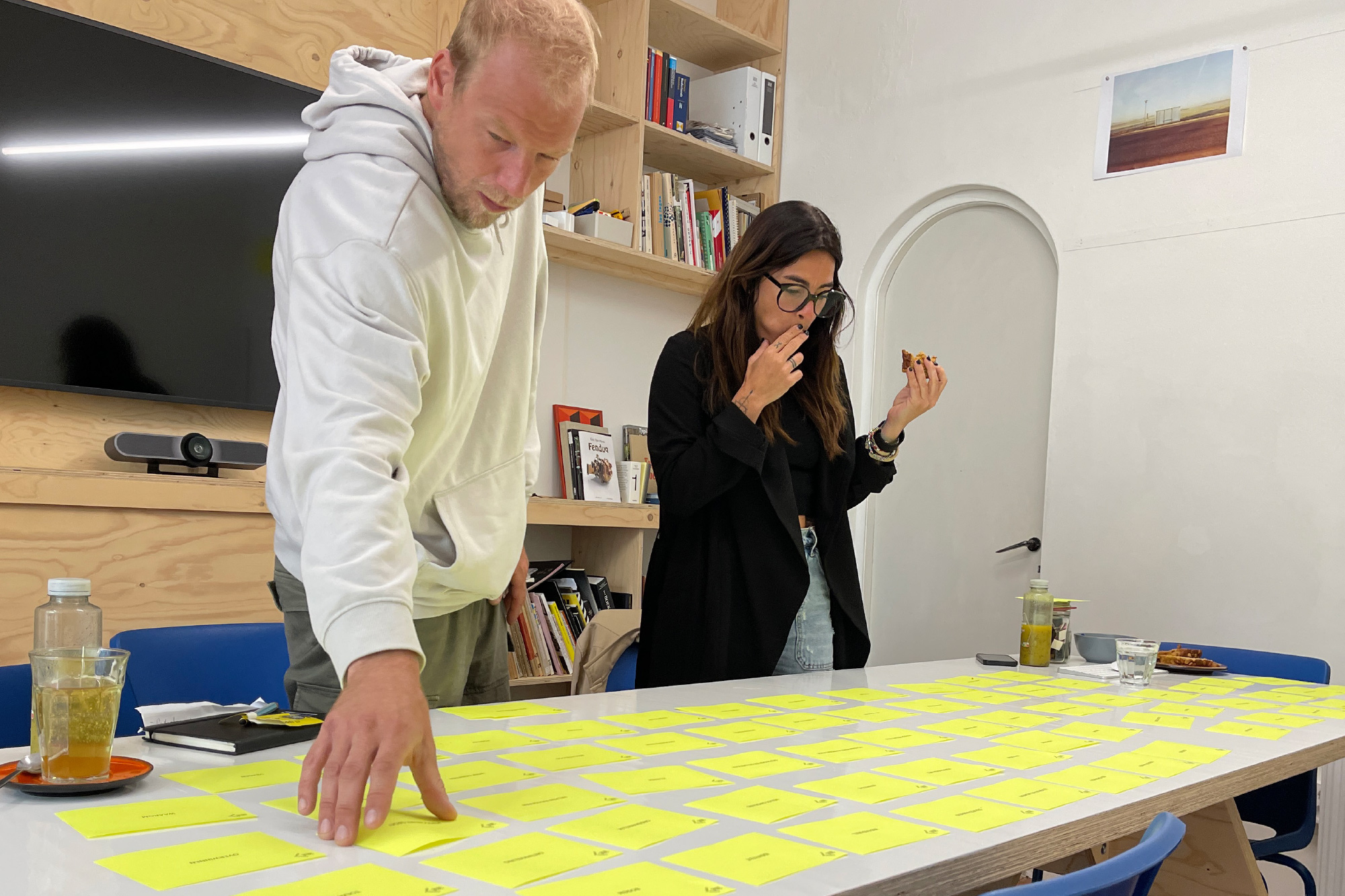
GROOW Active Spaces is a learning environment built around a single premise: people absorb more when they are inside the experience. Walk through a working engine block. Step into a simulated operating room. The founders, Patricia and Vincent, come from backgrounds in top-level sport, coaching, and education. They know that the right environment changes everything. The brief called for a brand identity that could carry that energy across every surface it touched.
Brand Identity Design for an Experiential Learning Platform
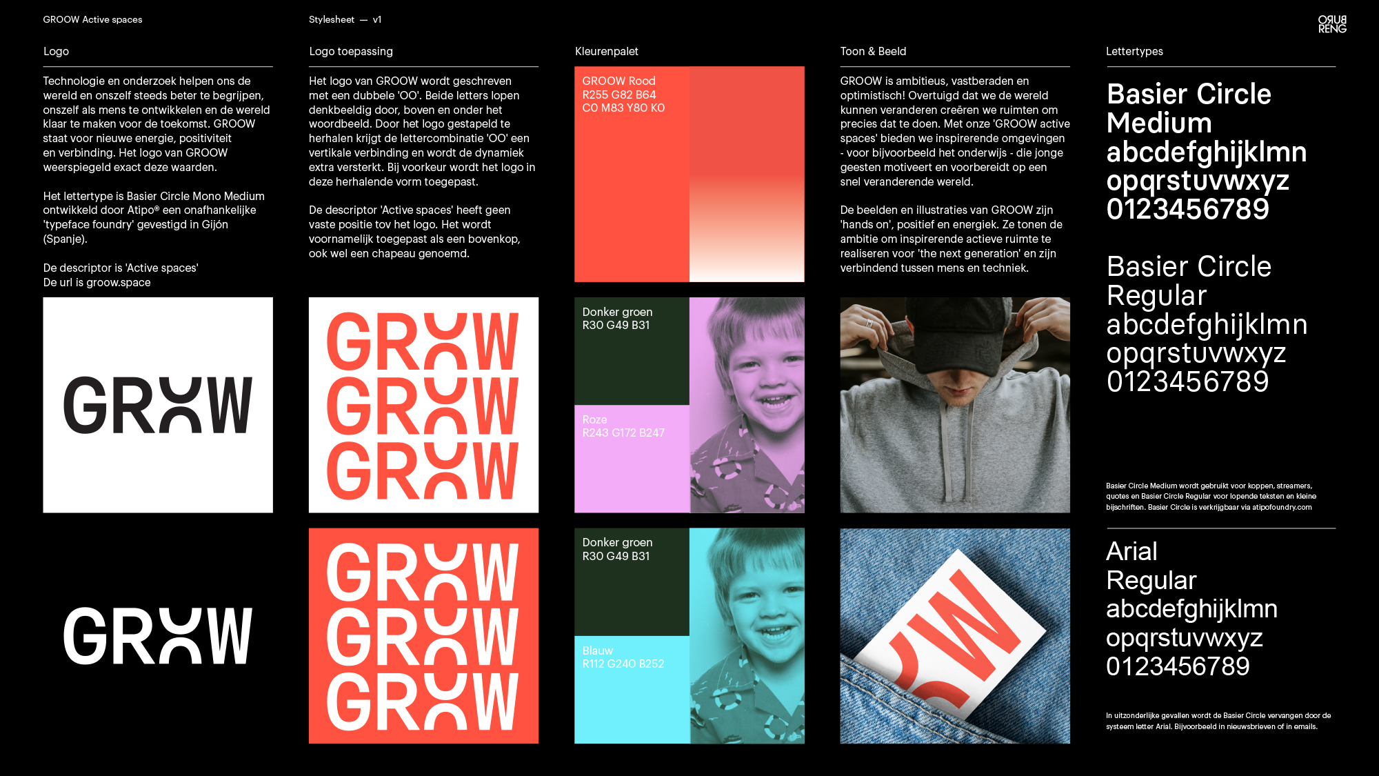
The studio began with their MerkKompas process — a brand strategy tool that strips a concept back to its core. For GROOW, that core is learning by experiencing. From that single idea, Buro Reng developed an identity that feels open and energetic without becoming decorative noise.
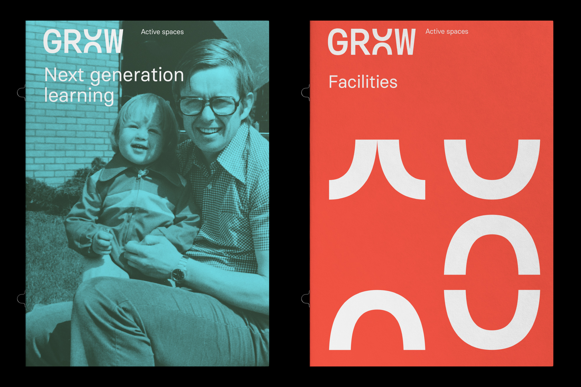
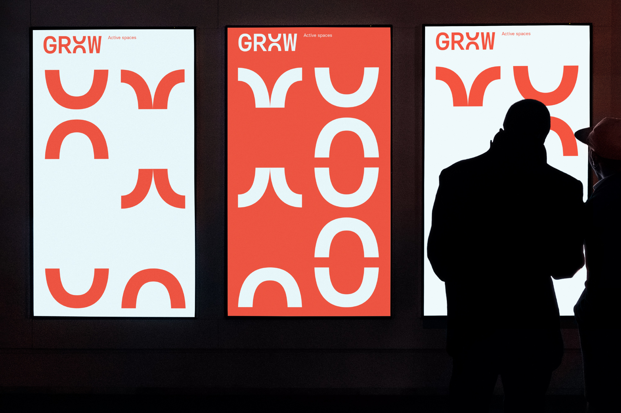
The color palette uses high-contrast, clear tones. There is no muddy mid-range. The colors are direct — they signal energy and clarity the way a well-lit workshop does. The typography follows the same logic: clean, geometric, and free of stylistic flourishes that would distract from the content.
What makes this brand identity design work is the flexibility built into its foundation. GROOW operates across physical active spaces, digital platforms, print publications, and signage. The system had to hold together across all of these touchpoints without losing its character. The business cards carry the same chromatic confidence as the magazine layouts. The screen mockups extend the visual logic into UI with no loss of coherence.
The brand stylesheet reveals the underlying rigor. Type scales, color values, spacing rules — everything is defined with enough precision that the system can grow. That matters for a brand like GROOW, which is actively expanding its collaborations with students, researchers, and companies.
Buro Reng is a design and communication studio based in Groningen, Netherlands. Their approach leans on strategy before aesthetics — the MerkKompas process is central to how they position a brand before a single mark is drawn. The GROOW project is a strong example of that method in action. The brand identity does not shout. It communicates. Visit the studio at buroreng.nl to see the full scope of their work.
This is the kind of brand identity design that makes a concept legible. GROOW needed to look like it felt: hands-on, focused, and built for people who learn best when they are fully inside the problem.


