by abduzeedo
Care Wireless brand identity by Classmate Studio gives a government program a friendly mascot emblem, warm blue palette, and a distinctly human presence.
Government connectivity programs carry a practical obligation that few consumer brands face: they must be instantly trustworthy to people who may be encountering them during a moment of financial difficulty. Care Wireless, which helps qualifying individuals access the Affordable Connectivity Program, needed a brand identity that communicated care and competence equally, without defaulting to the cold institutional look of large telecom operators.
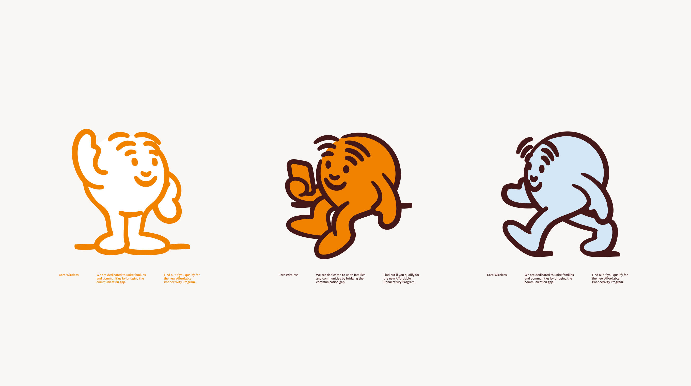
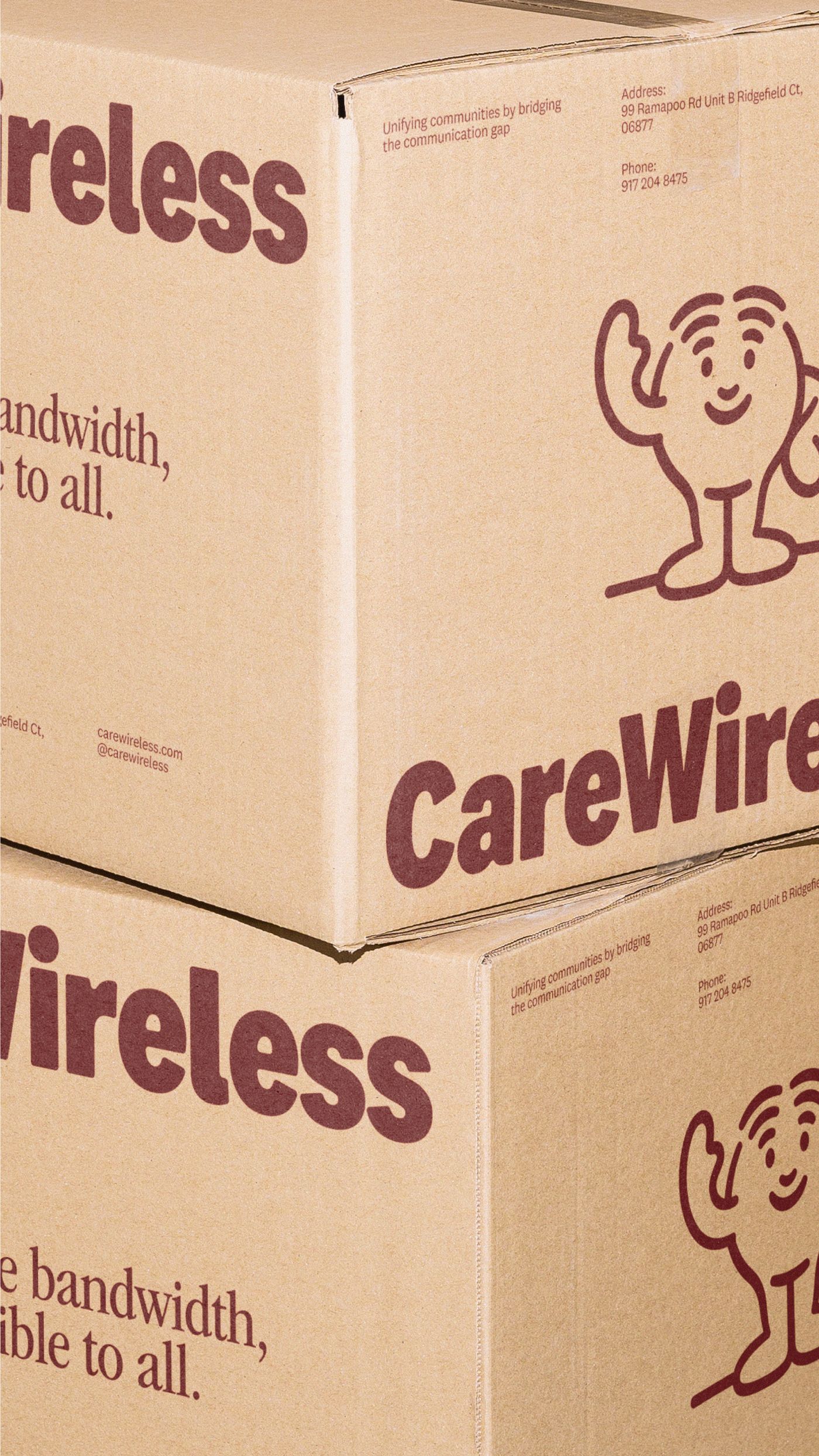
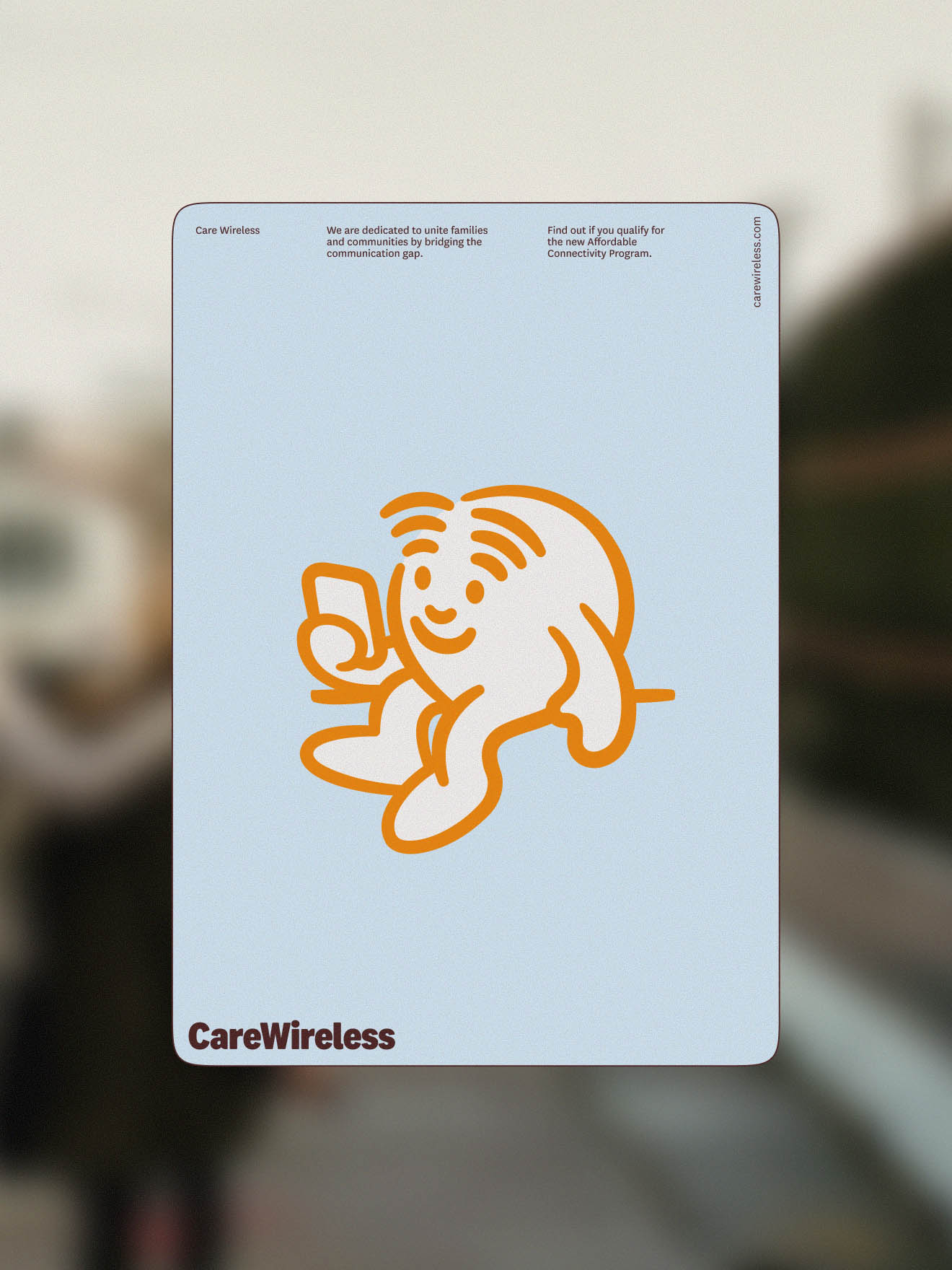
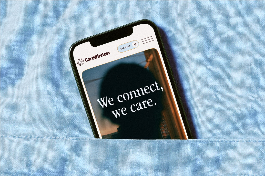
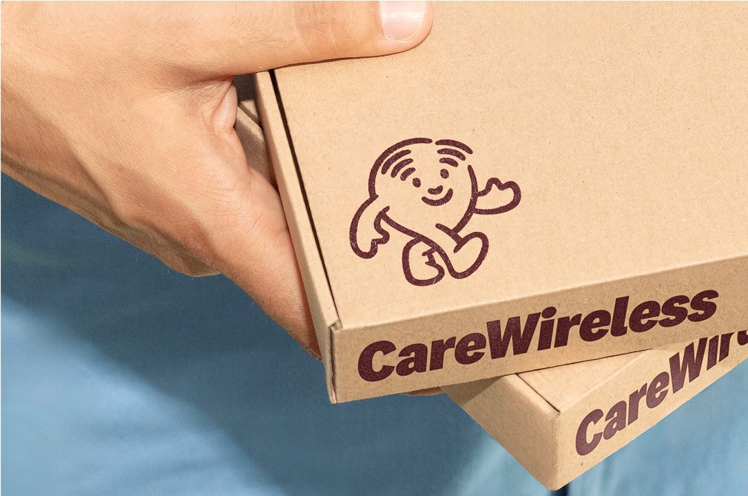
Classmate Studio approached the Care Wireless brand identity around a single strategic idea: giving the program a human face. The team built the system around a friendly mascot emblem that functions as both a visual anchor and an expression of the company's values. The character communicates a guiding, caring presence and stands in for the support Care Wireless provides to its users every day.
Colour and Typography in the Care Wireless Brand Identity
The Care Wireless brand identity palette uses light, trustworthy blues as its primary tone, supplemented by optimistic orange accents. This combination steers deliberately away from the deep navy and corporate grey that dominate telecom visual language. The blues read as calm and reliable while the orange introduces energy and warmth without tipping into the aggressive promotional register of mobile carrier advertising throughout the brand identity.
Modern typography completes the Care Wireless brand identity system, reinforcing the clarity and directness that users navigating a government benefit program require. Every typographic decision prioritises legibility and approachability. The mascot, the palette, and the type choices work as a coherent brand identity system rather than a collection of independently strong elements with no shared logic.
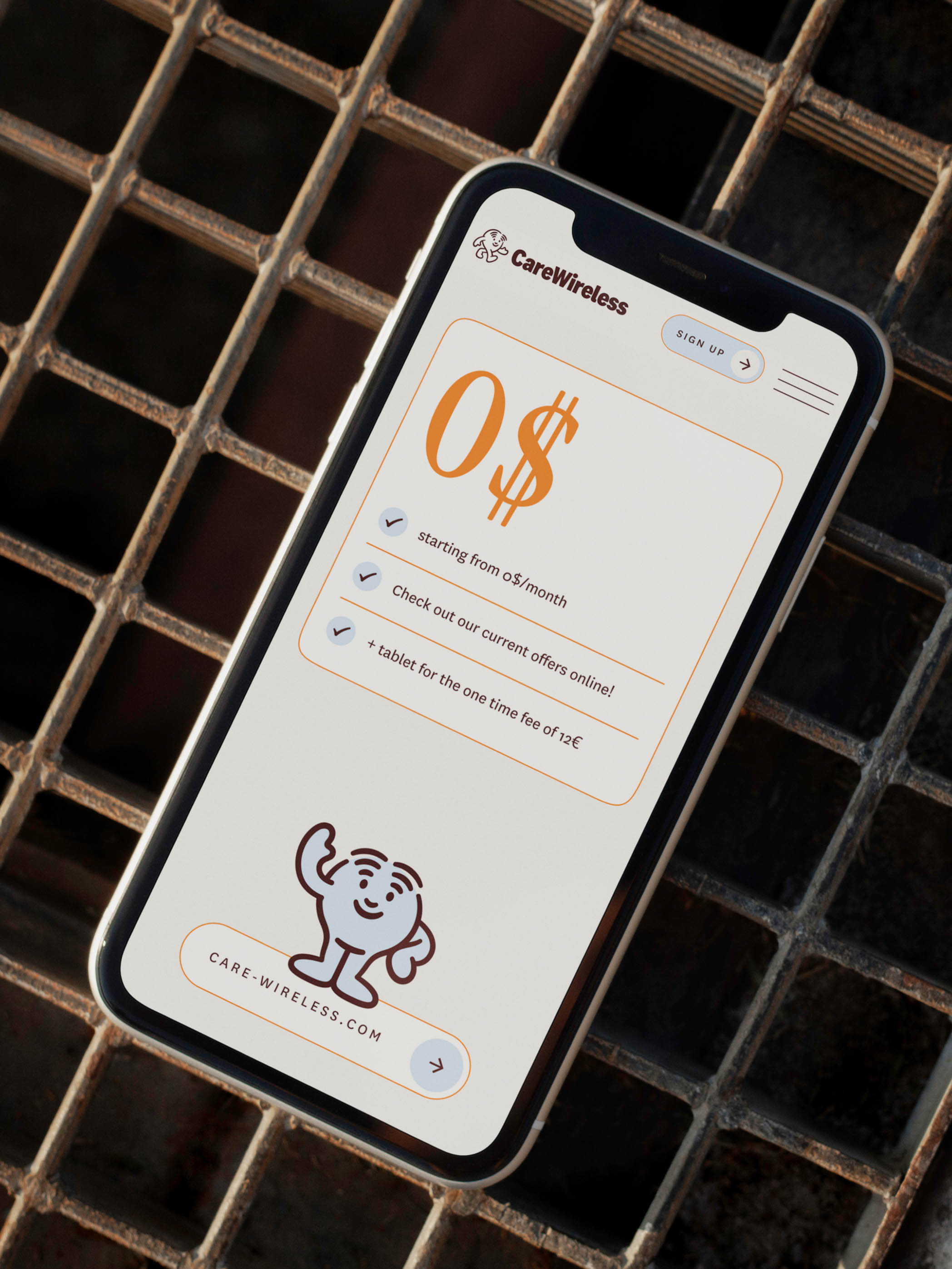
The result is a Care Wireless brand identity that reads as clear, optimistic, and distinctly human. Classmate Studio's stated goal was making the Affordable Connectivity Program feel approachable, and the final brand identity achieves exactly that. Users encounter a visual system that guides rather than intimidates, which matters when the audience includes people uncertain about whether they qualify or how to begin the application process.
For designers working on public-sector or social-impact branding, the Care Wireless brand identity demonstrates that warmth and clarity are not opposing goals. The mascot-led approach provides a memorable entry point while the restrained palette and clean typography maintain the credibility the program needs to build lasting user trust.