by alex
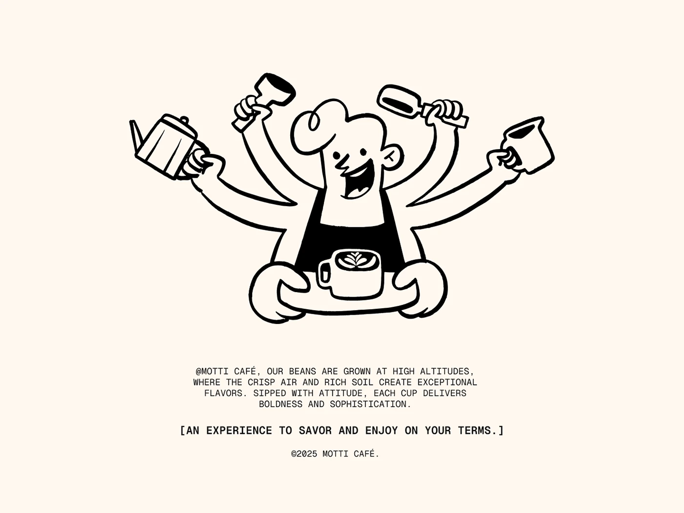
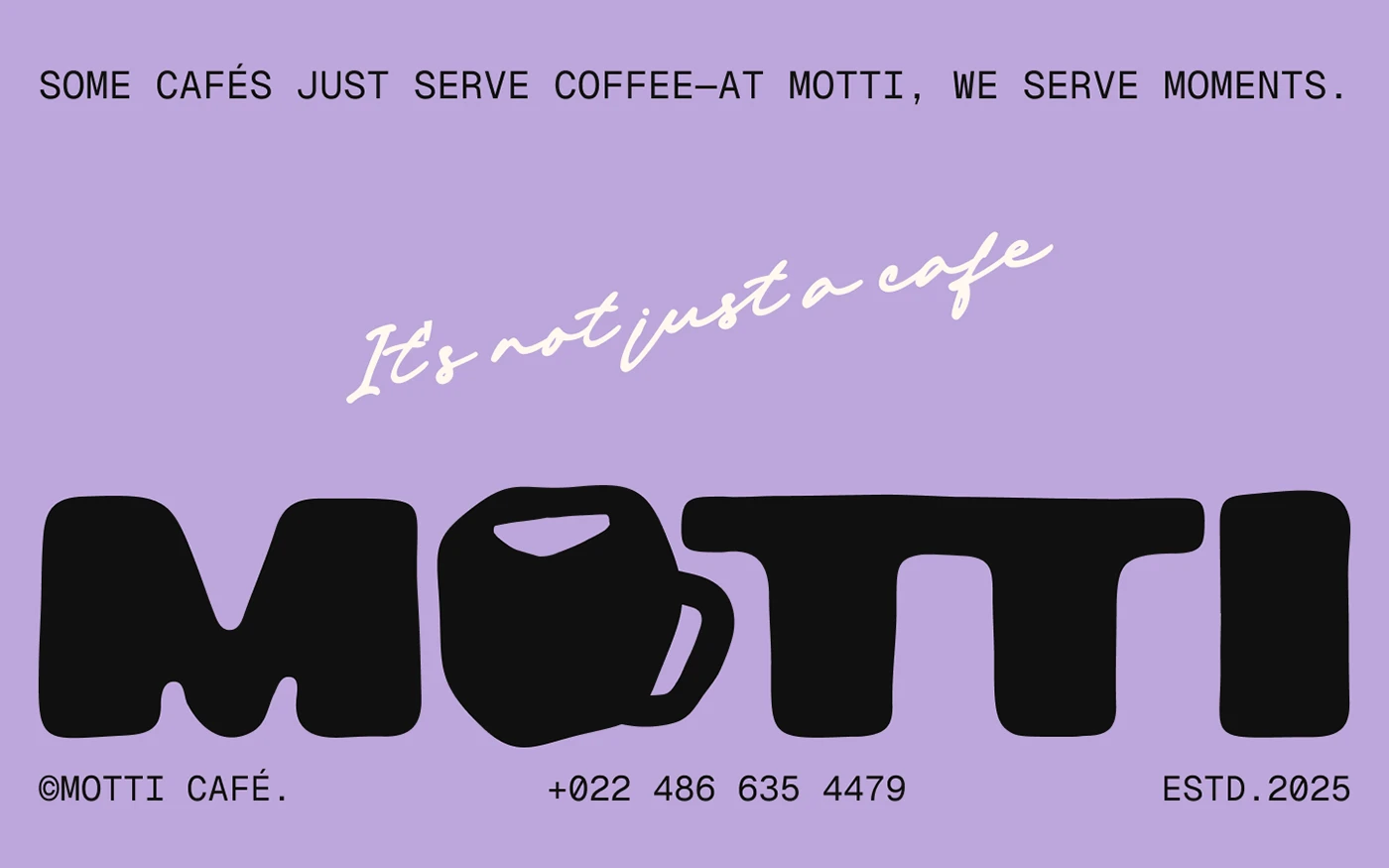
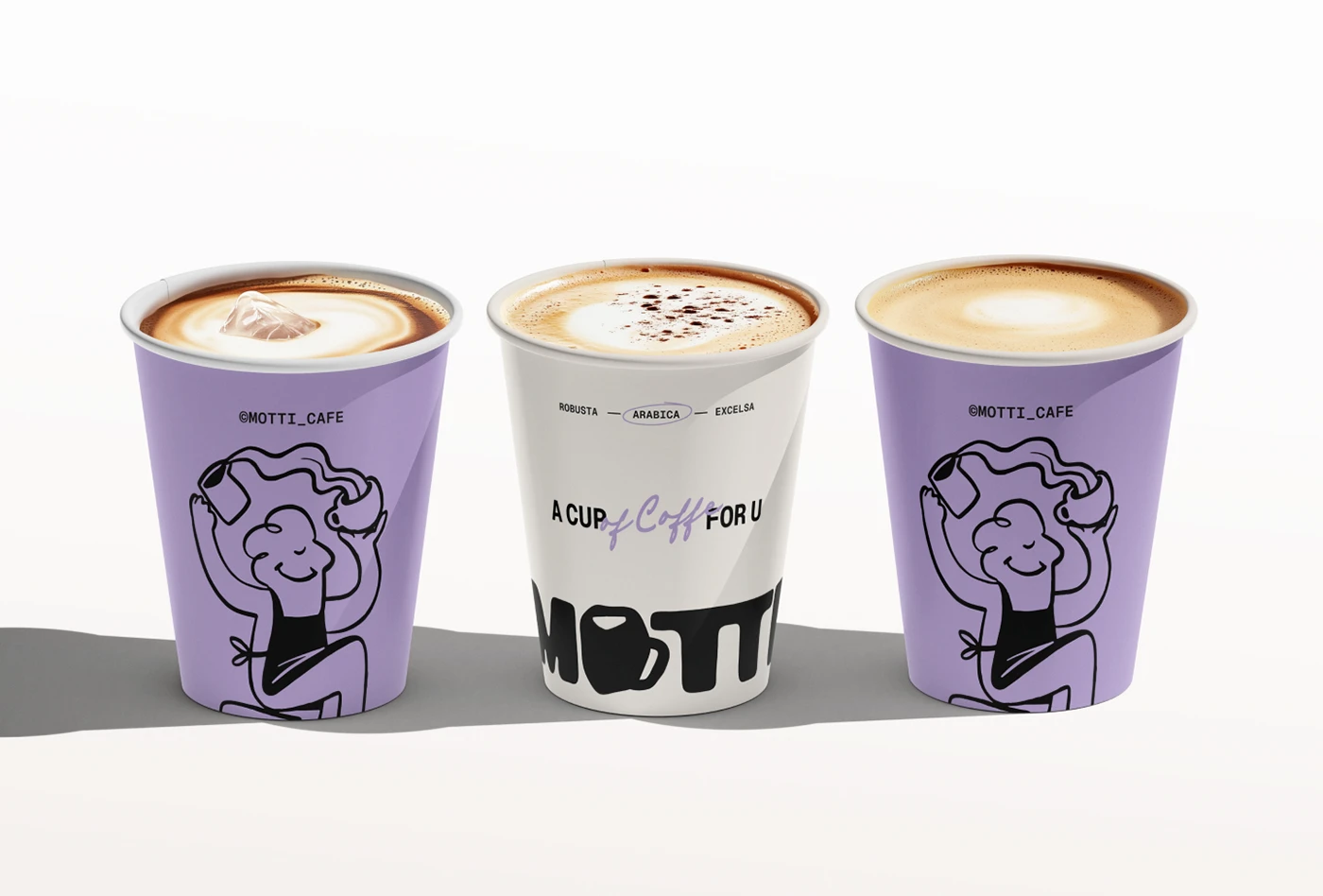
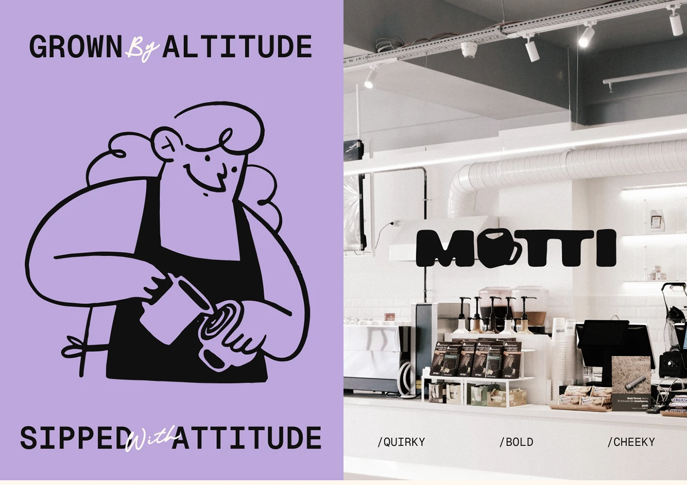
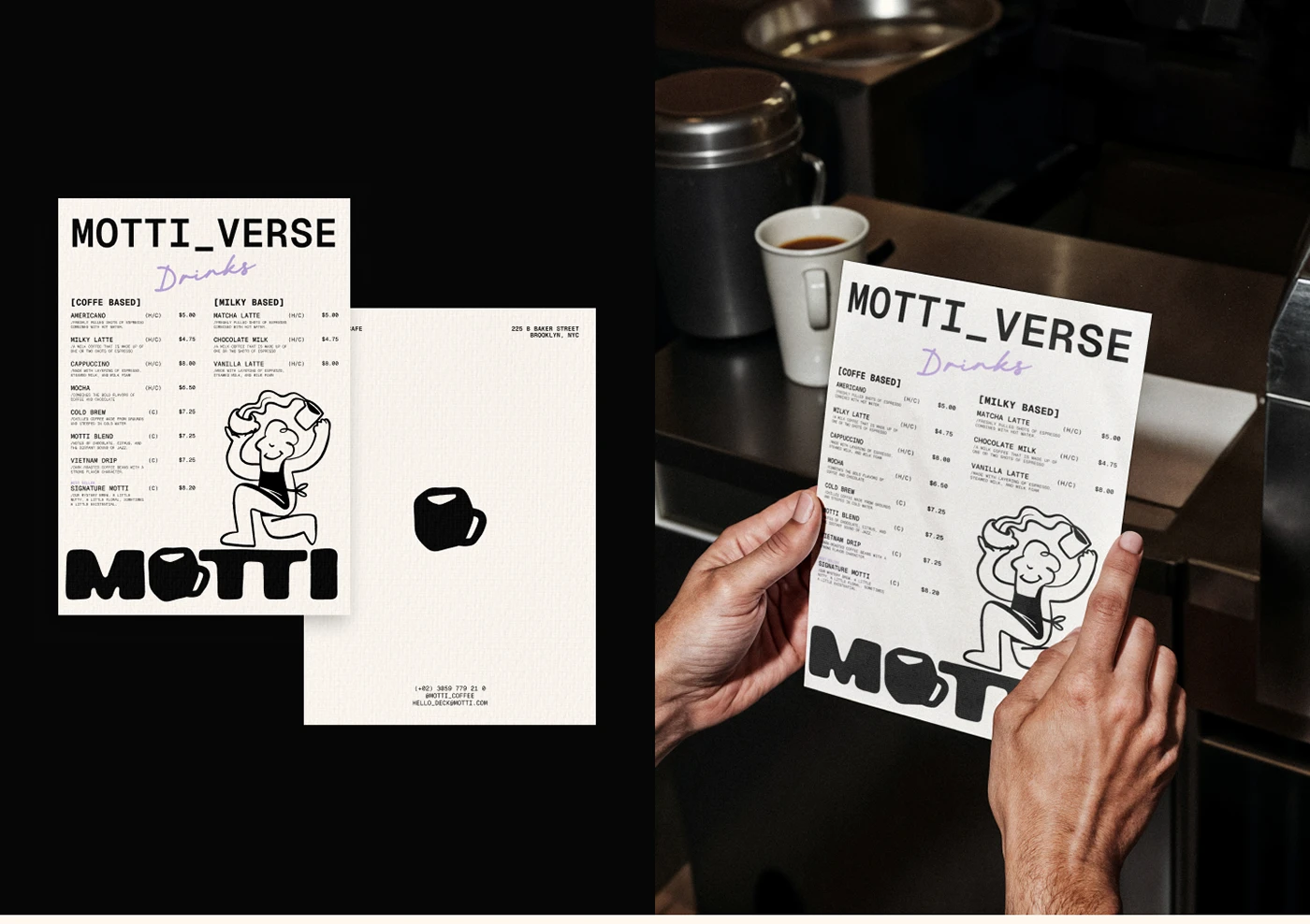
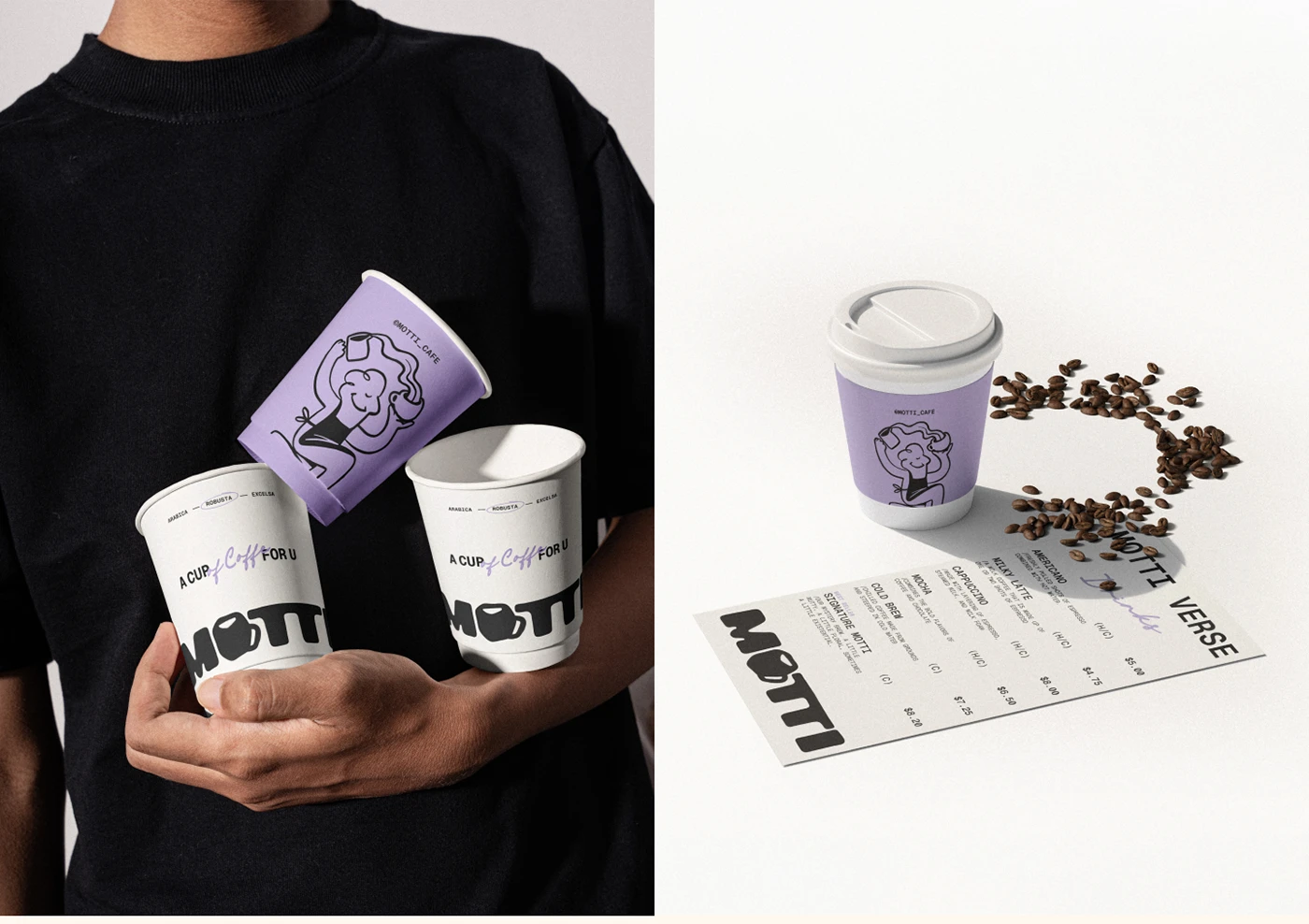
Studio Moara's cafe branding system delivers complete identity—logo, mascot, packaging and signage unified by warm tones and hand-drawn illustration. The identity centers on a hand-drawn mascot across every touchpoint—menu, packaging, storefront. Rather than decoration, Studio Moara made it structural. The palette moves between warm terracotta and cream, with an accent that holds weight without heaviness.
Cafe Branding System by Studio Moara
The packaging reveals the depth. Instead of treating the box as a container, Studio Moara built a complete visual language—dielines reveal illustration, typography guides the eye, negative space lets each element breathe. Stationery and menus follow: one typeface, the mascot applied consistently, color held back. Studio Moara's portfolio shows how strong cafe branding holds across all touchpoints.